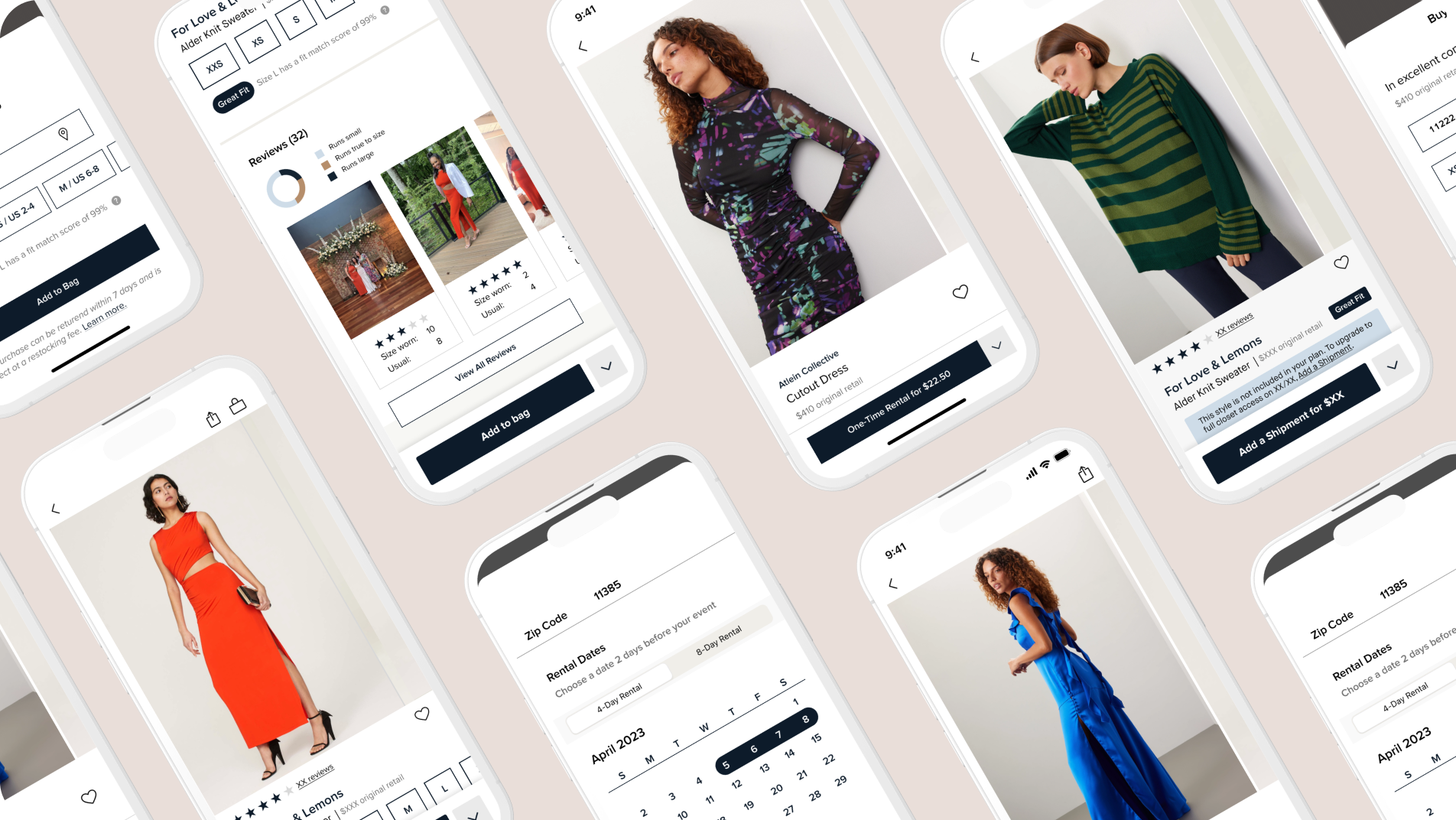
Unavailable Hearts is where 70% of Members start when looking for items for their next shipment on the Rent the Runway App but they often encounter dead-ends.
The Challenge
BUSINESS GOALS
As part of the refactor for the iOS app (moving from Obj-C to SwiftUI) we saw a great opportunity within the Hearts Tab (think of Hearts as a 'playlist for clothes').
The Hearts tab held integral technology for us to unlock upcoming work on the grid, where tens of thousands of items can be browsed.
USER GOALS
When choosing items for their next shipment, 70% of users start their journey within their Hearts Tab.
However, many users encounter issues with availability and have to go three screens deep to discover whether or not they can rent that item for their next shipment, often resulting in a frustrating dead-end.
Old Hearts
ALIGNMENT
We started by pointing out key missteps in our existing designs and brainstorming what we could do to address user painpoints using existing customer data via Looker, and competitive/best-in-class analysis. While identifying these painpoints we also wanted to make sure the big changes we were suggesting wouldn't interfere or prevent us from moving on to other parts of the app like 'Home' and 'Grid' pages.
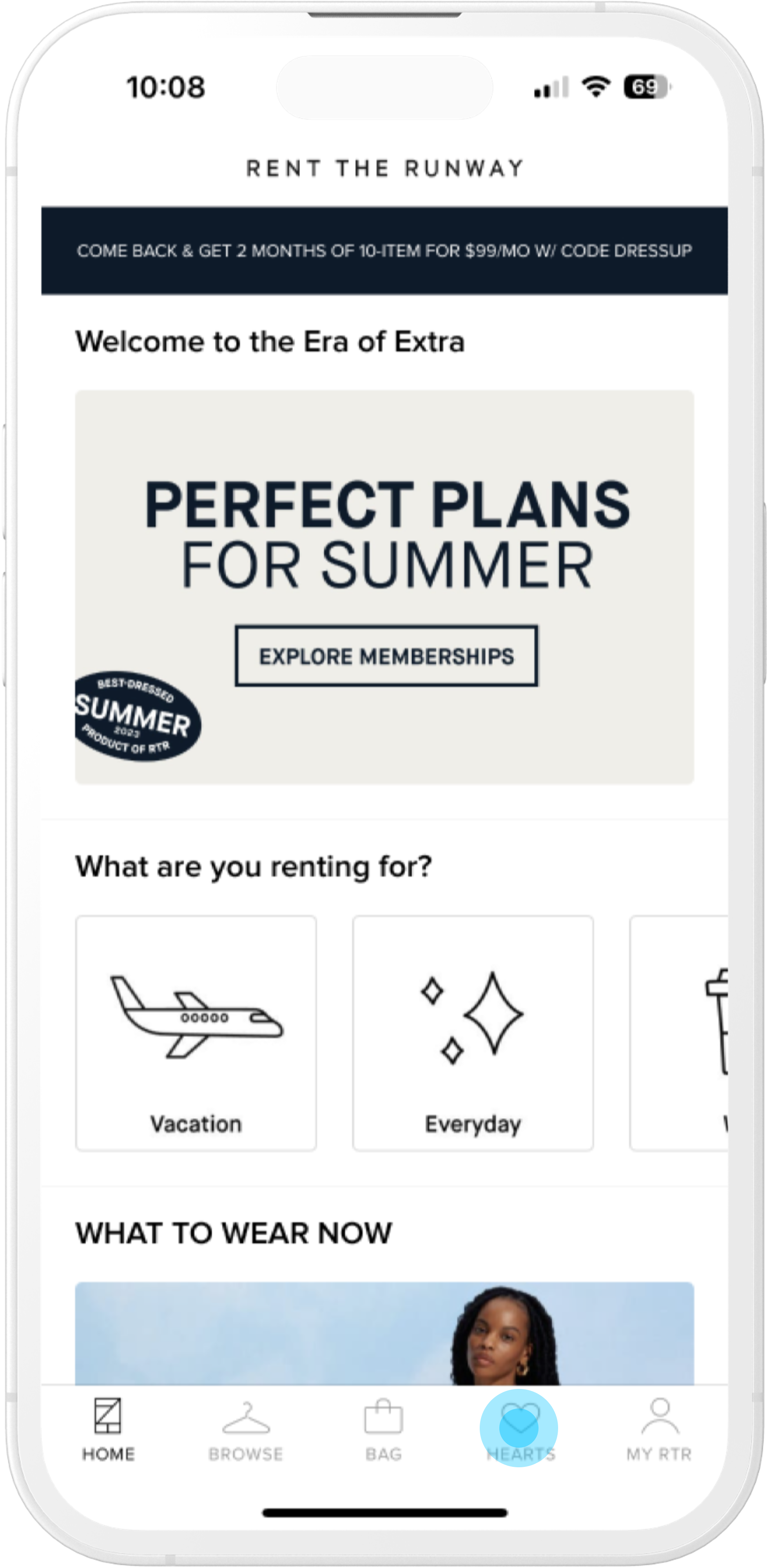
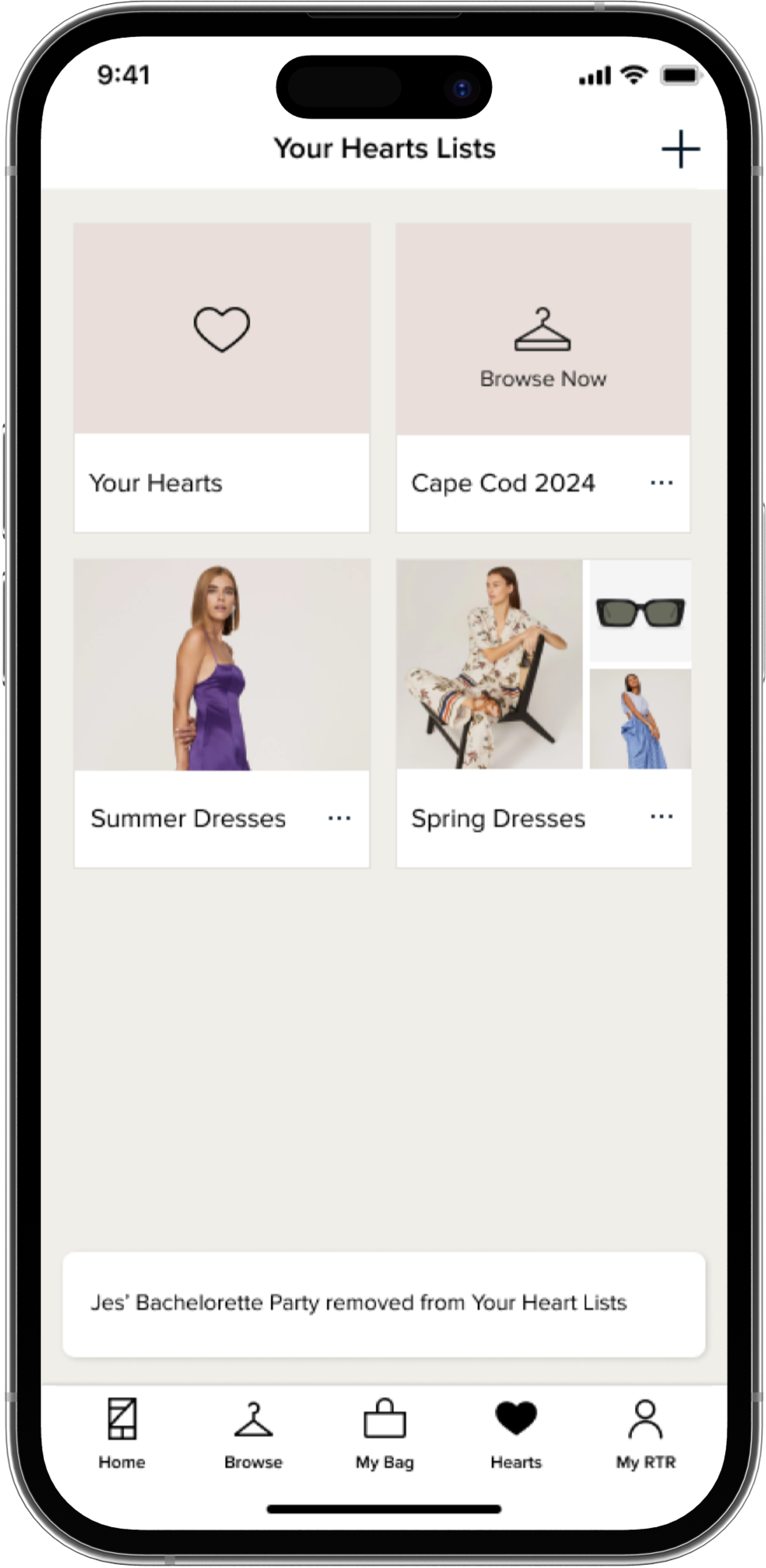
Opening the app users land on Home and can navigate to Hearts
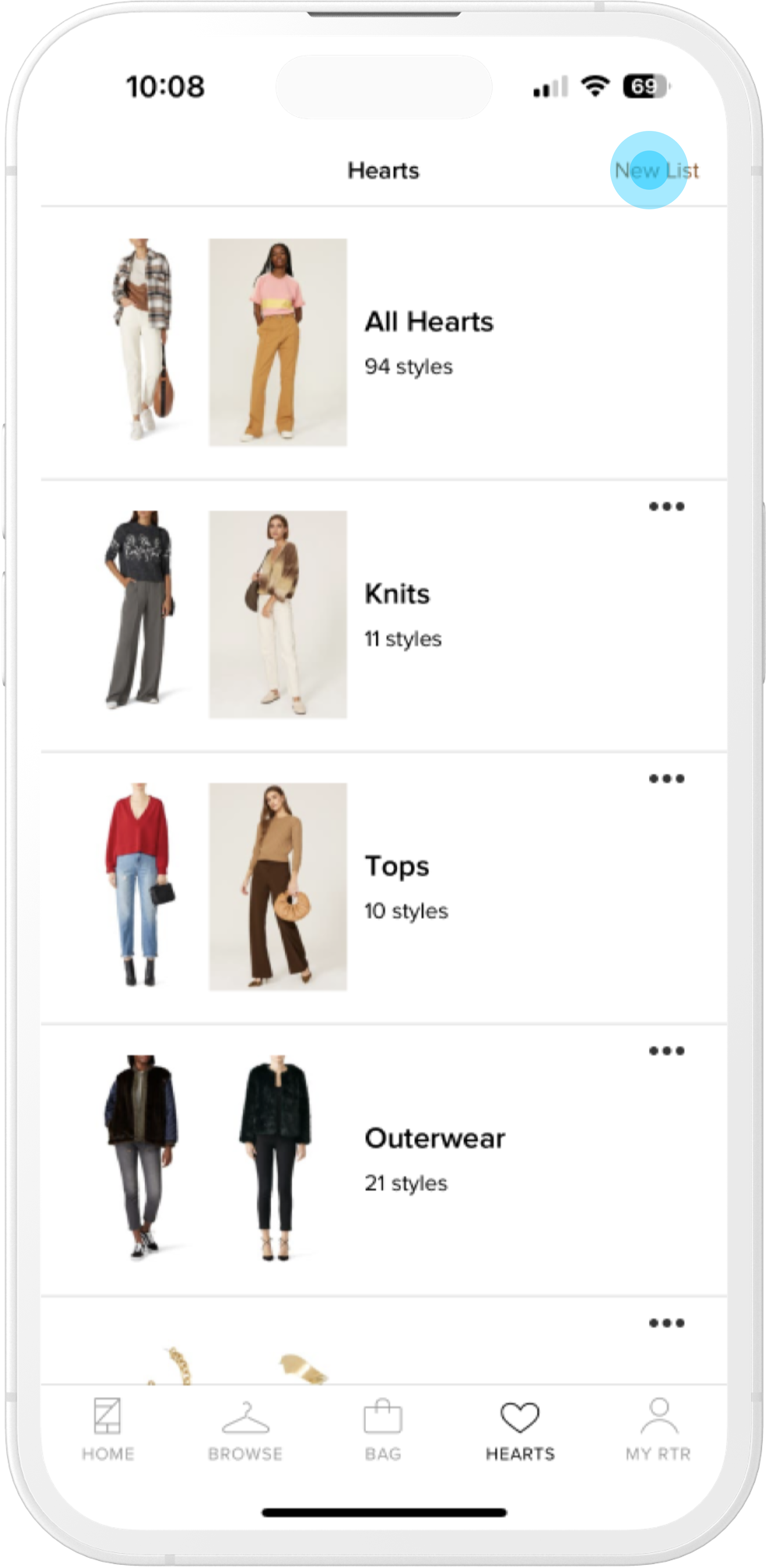
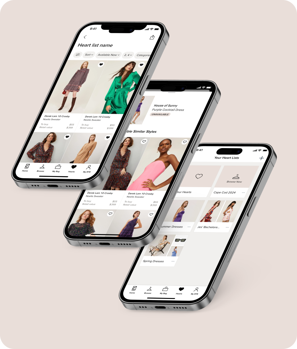
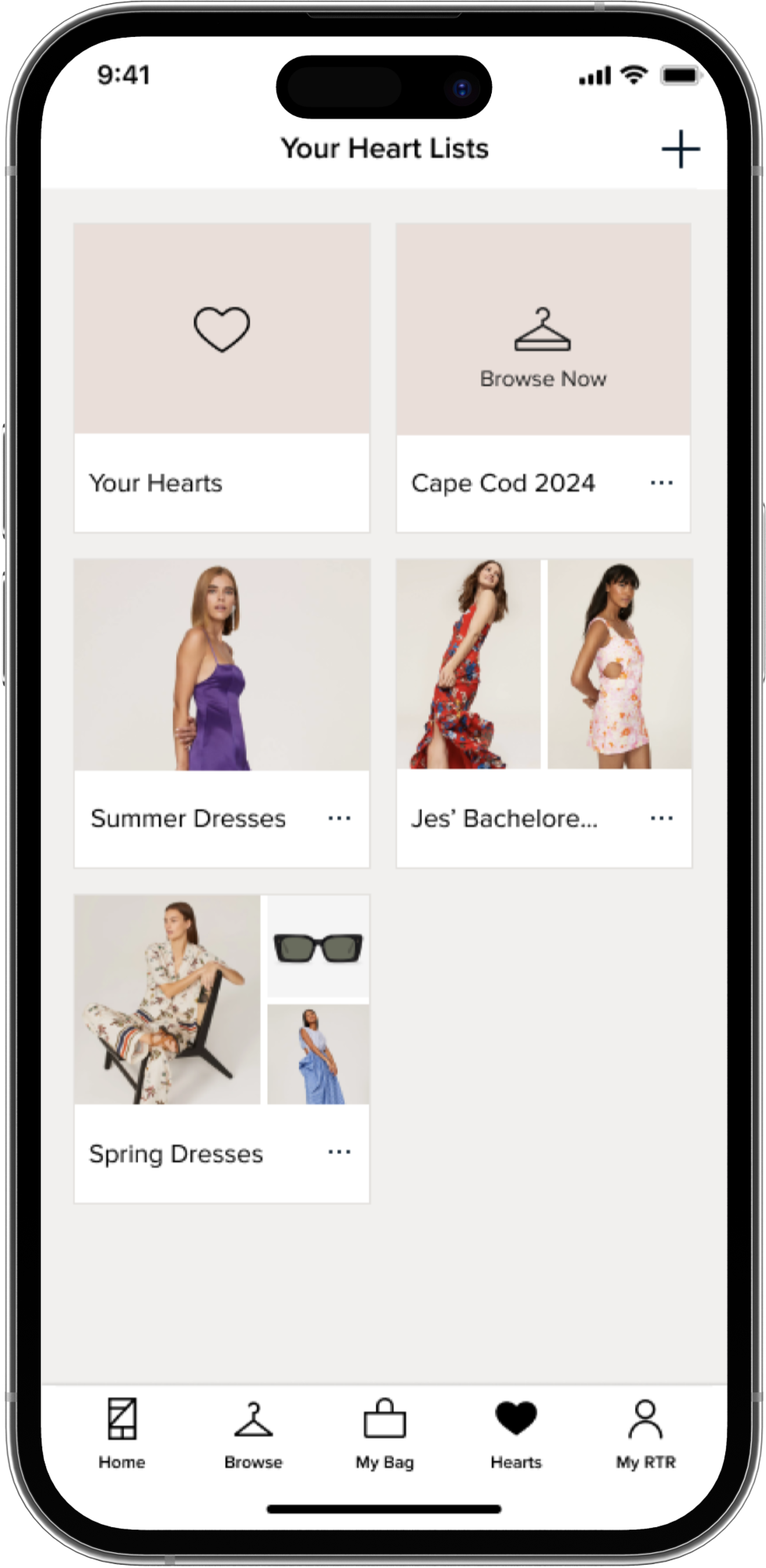
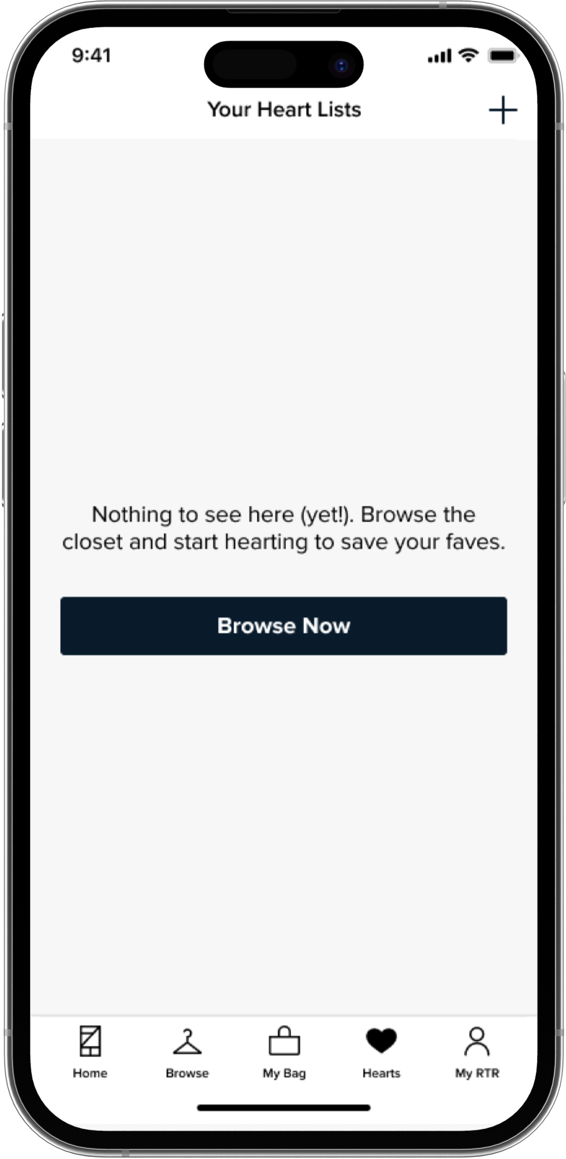
Within the Hearts tab, users can see any shortlists they've made and the ability to create a new list
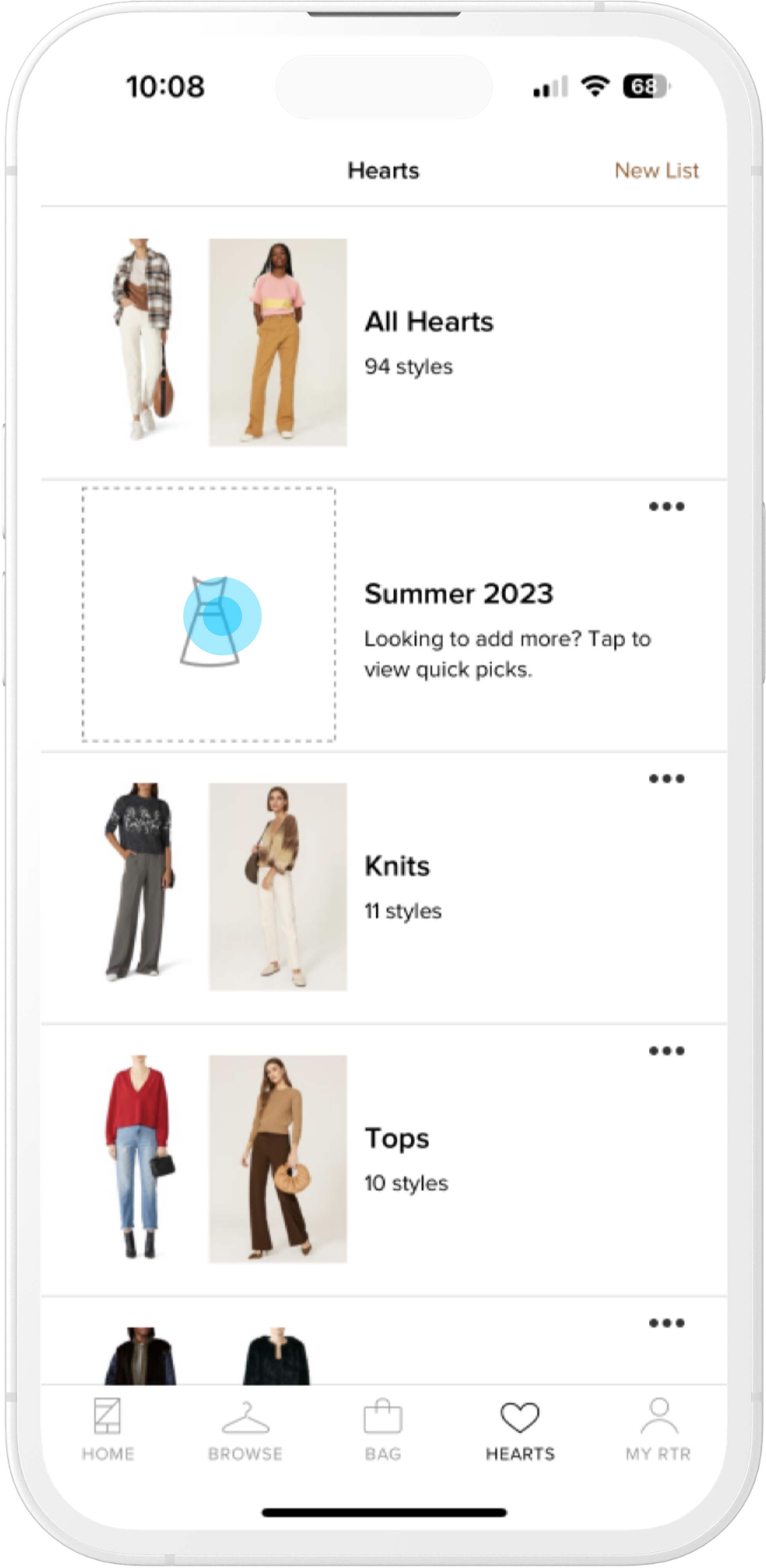
Creating a new list shows blank underneath "All Hearts" with instructive text
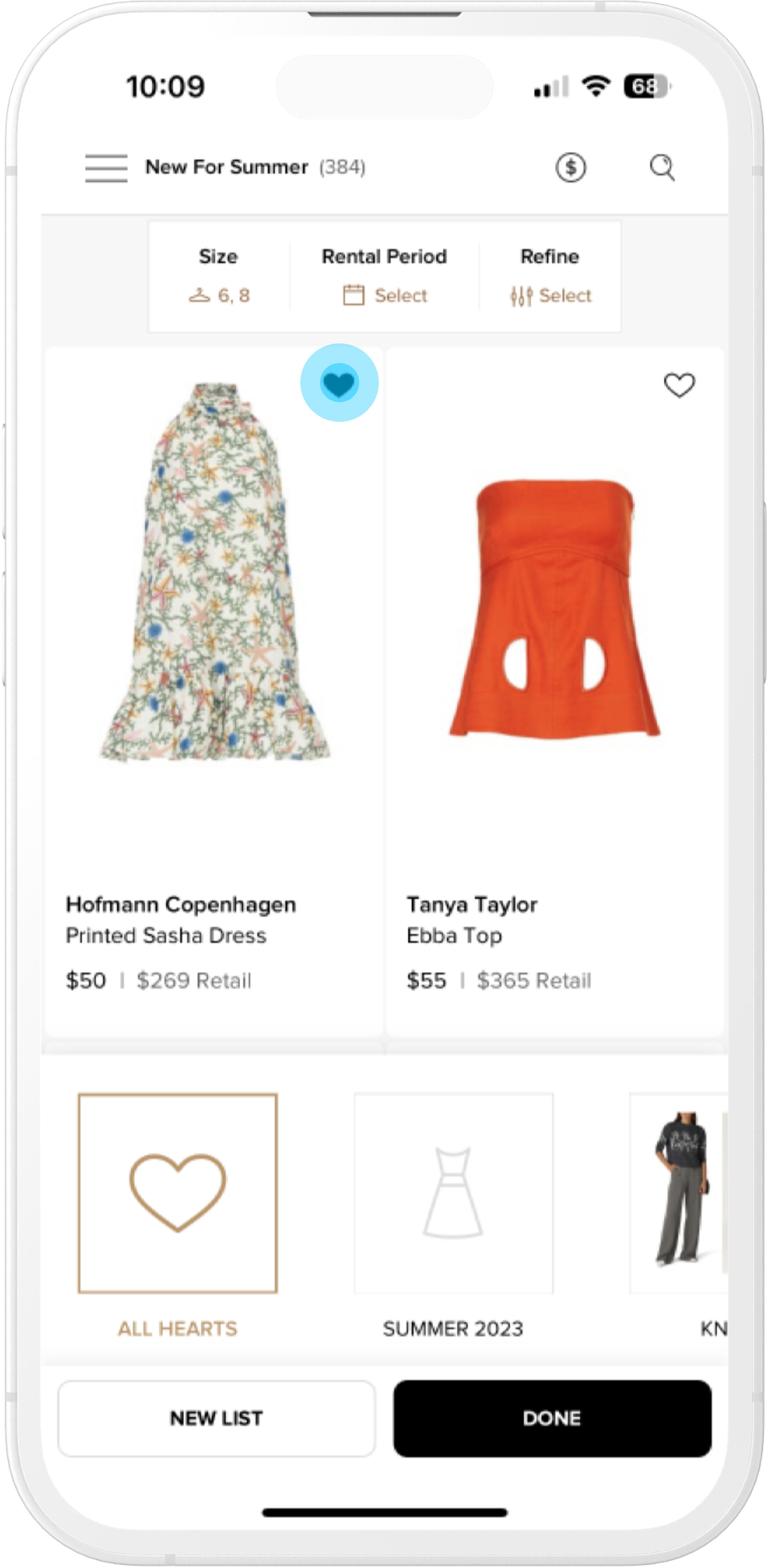
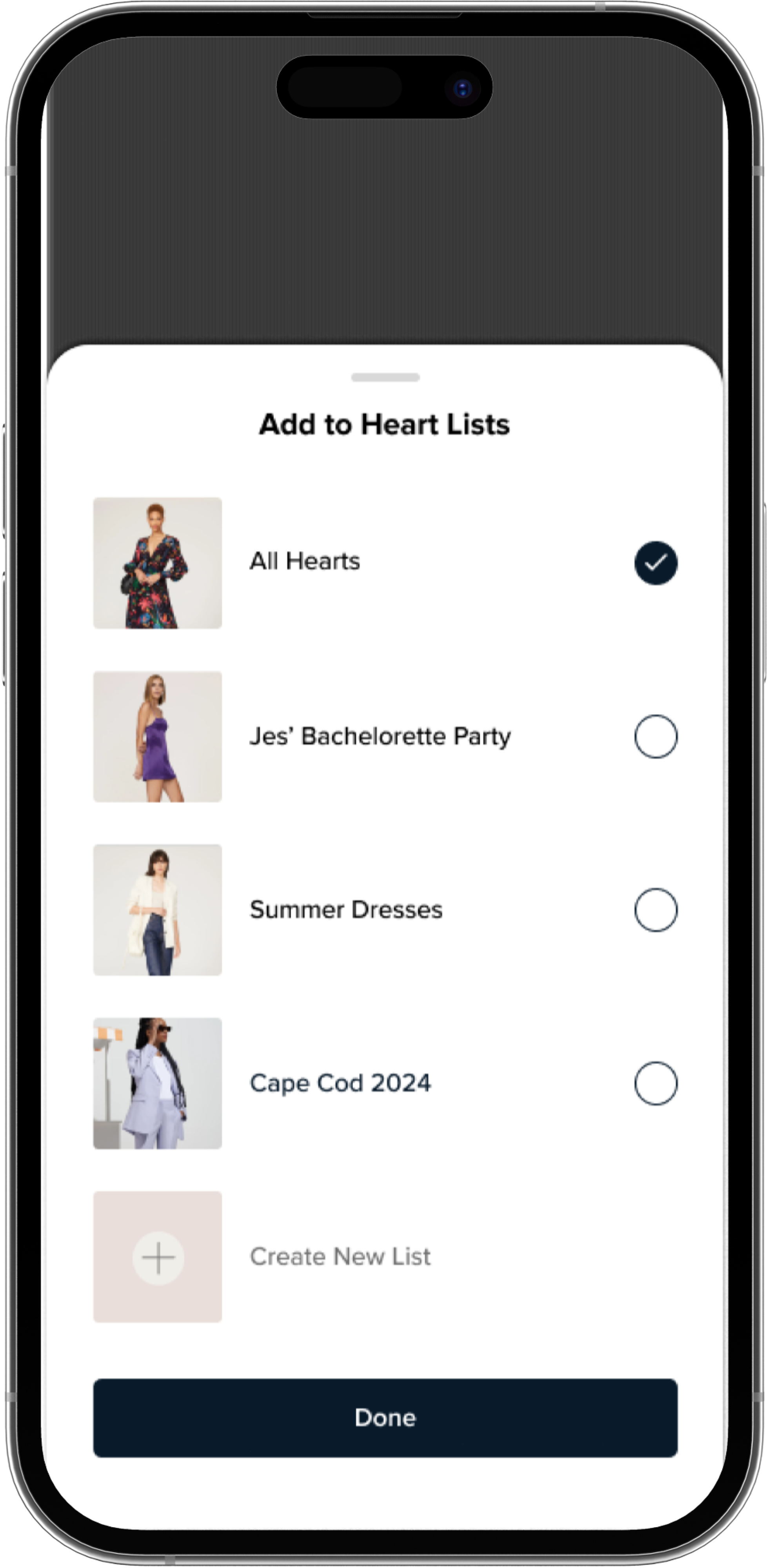
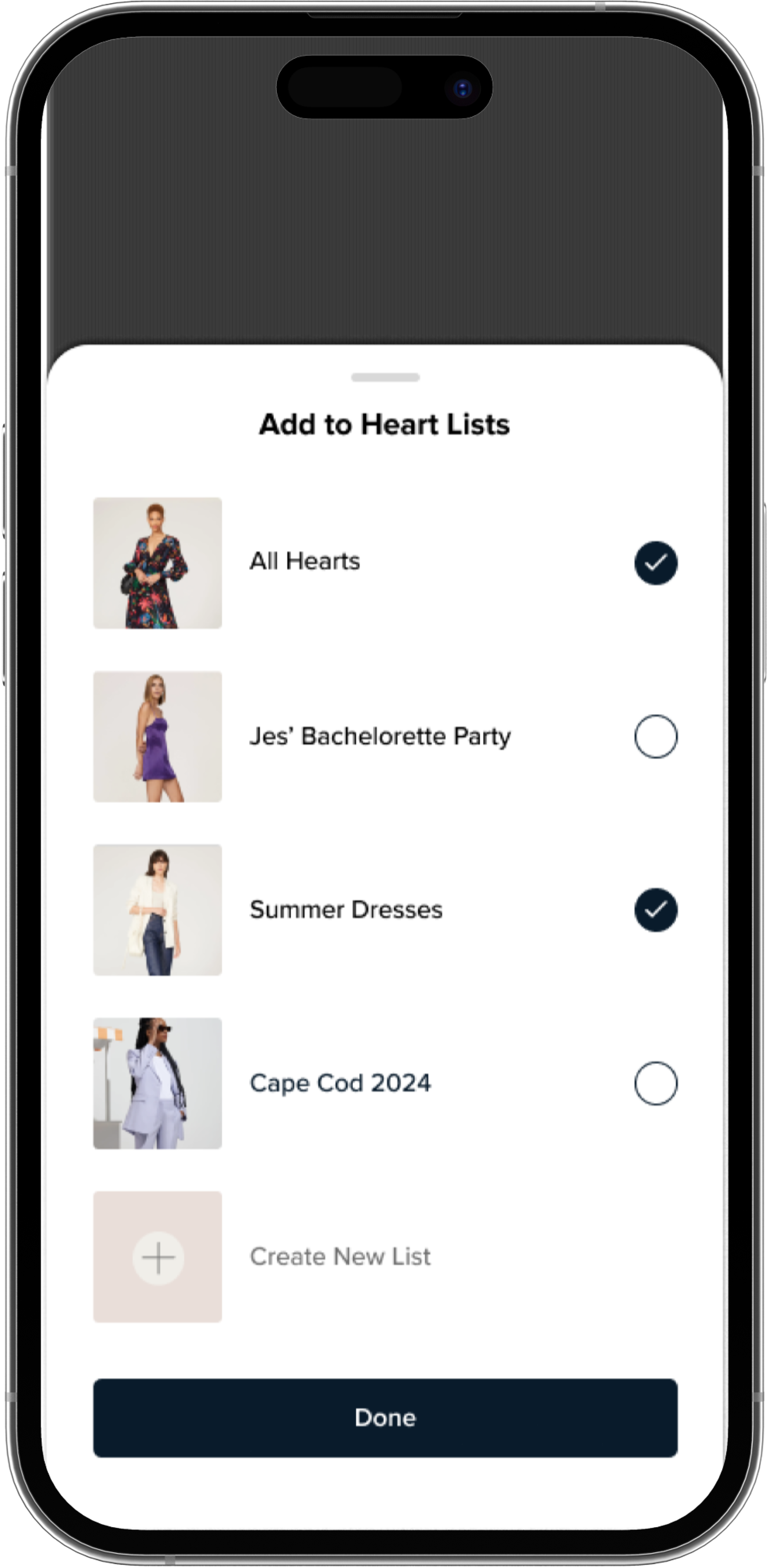
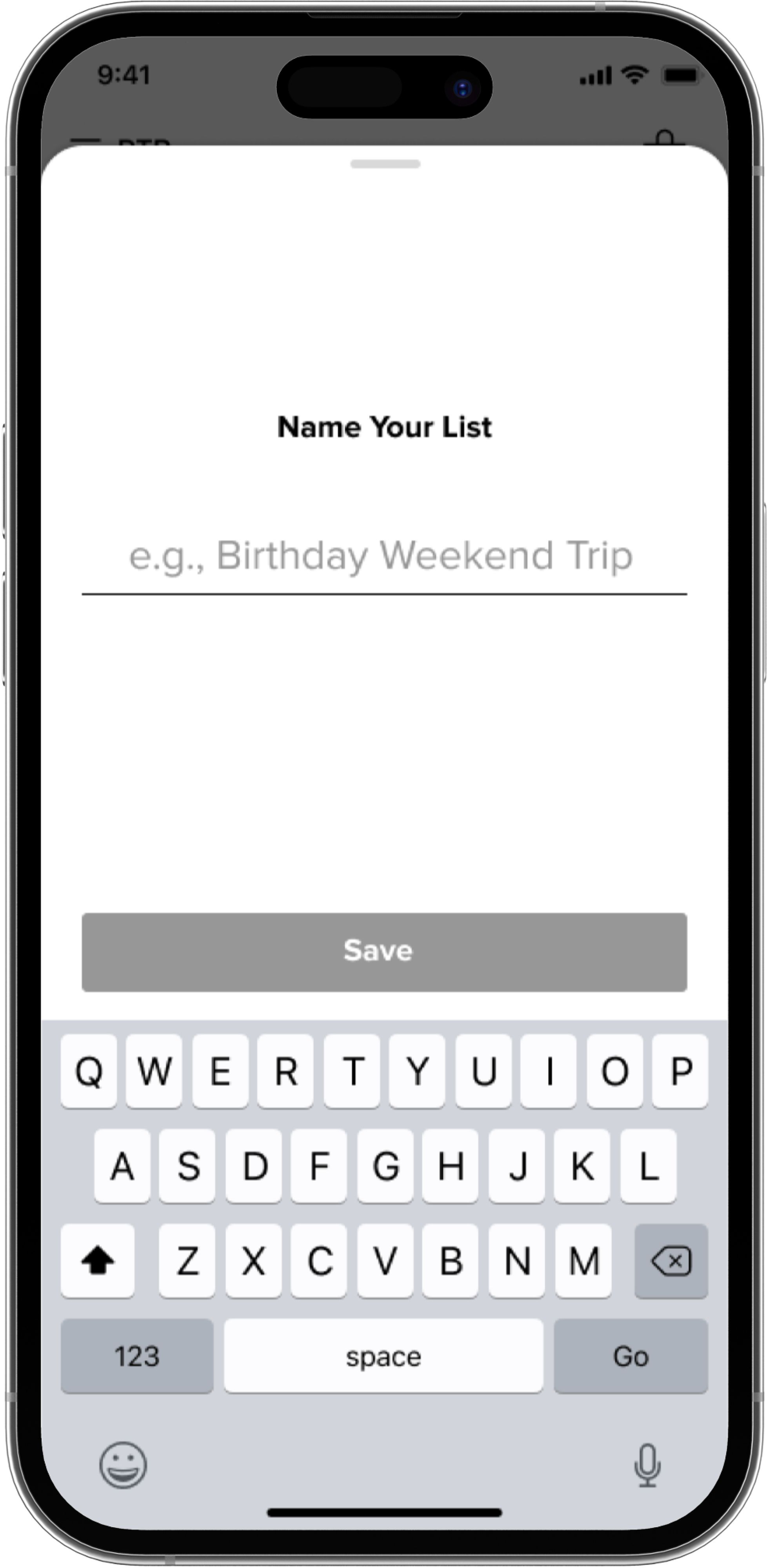
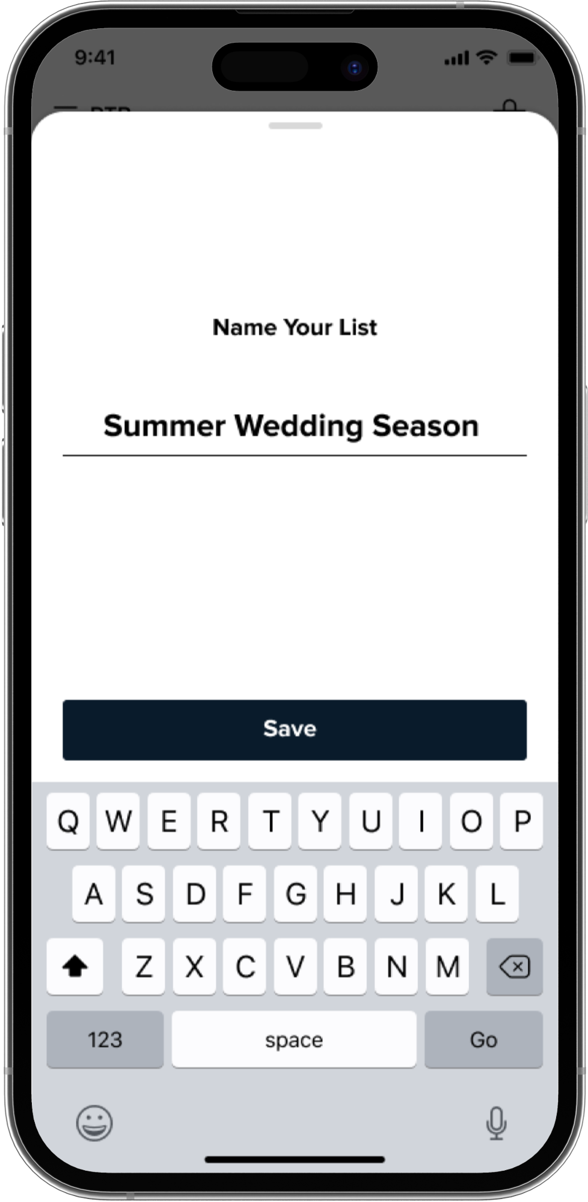
Lists with specific keywords (trends, events or seasonality) can bring users to a more pointed grid. Hearting an item brings up a drawer allowing users to select the lists to apply the item to
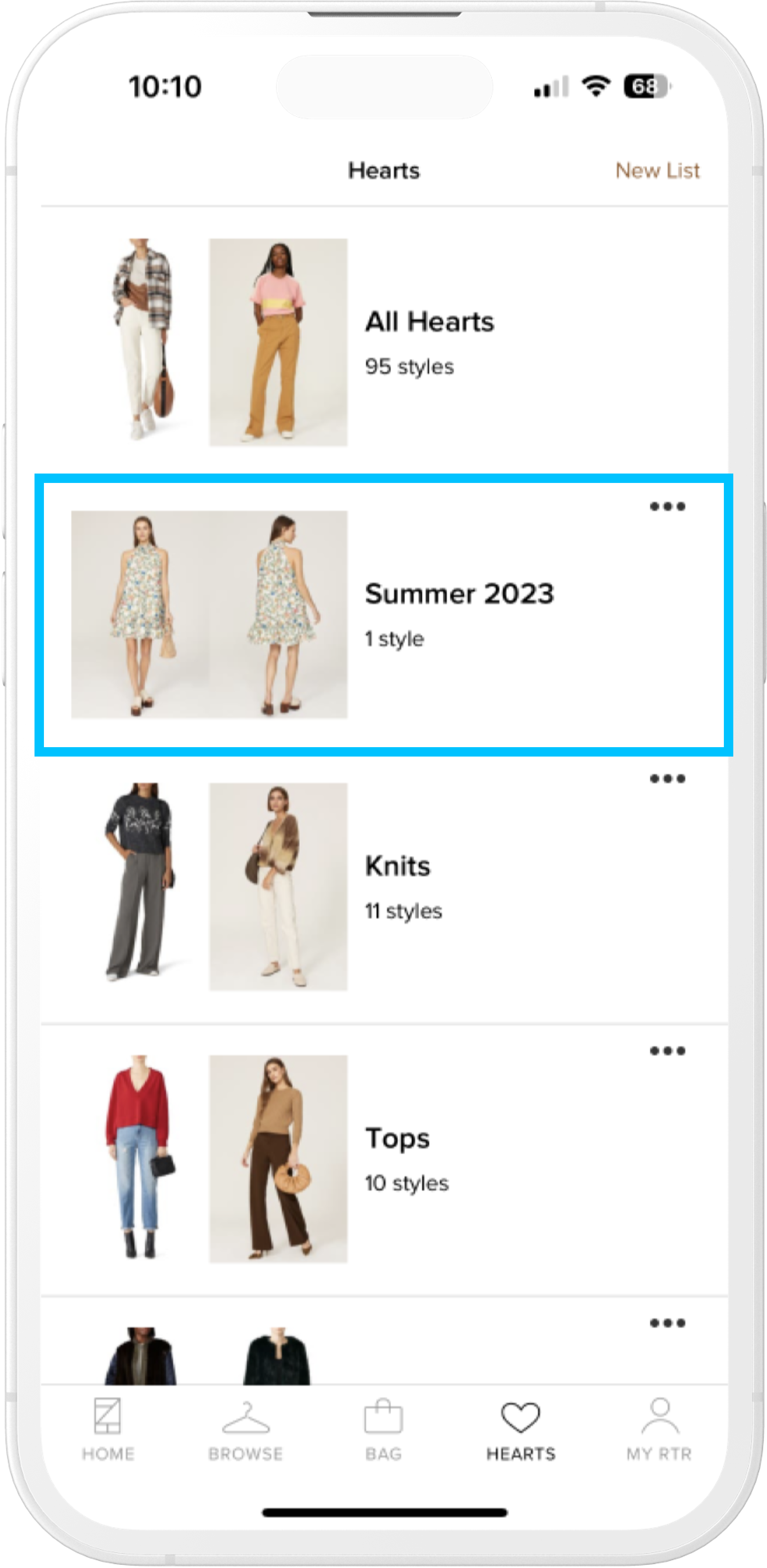
Going back to hearts users see the two most recently hearted items within their appropriate list(s)
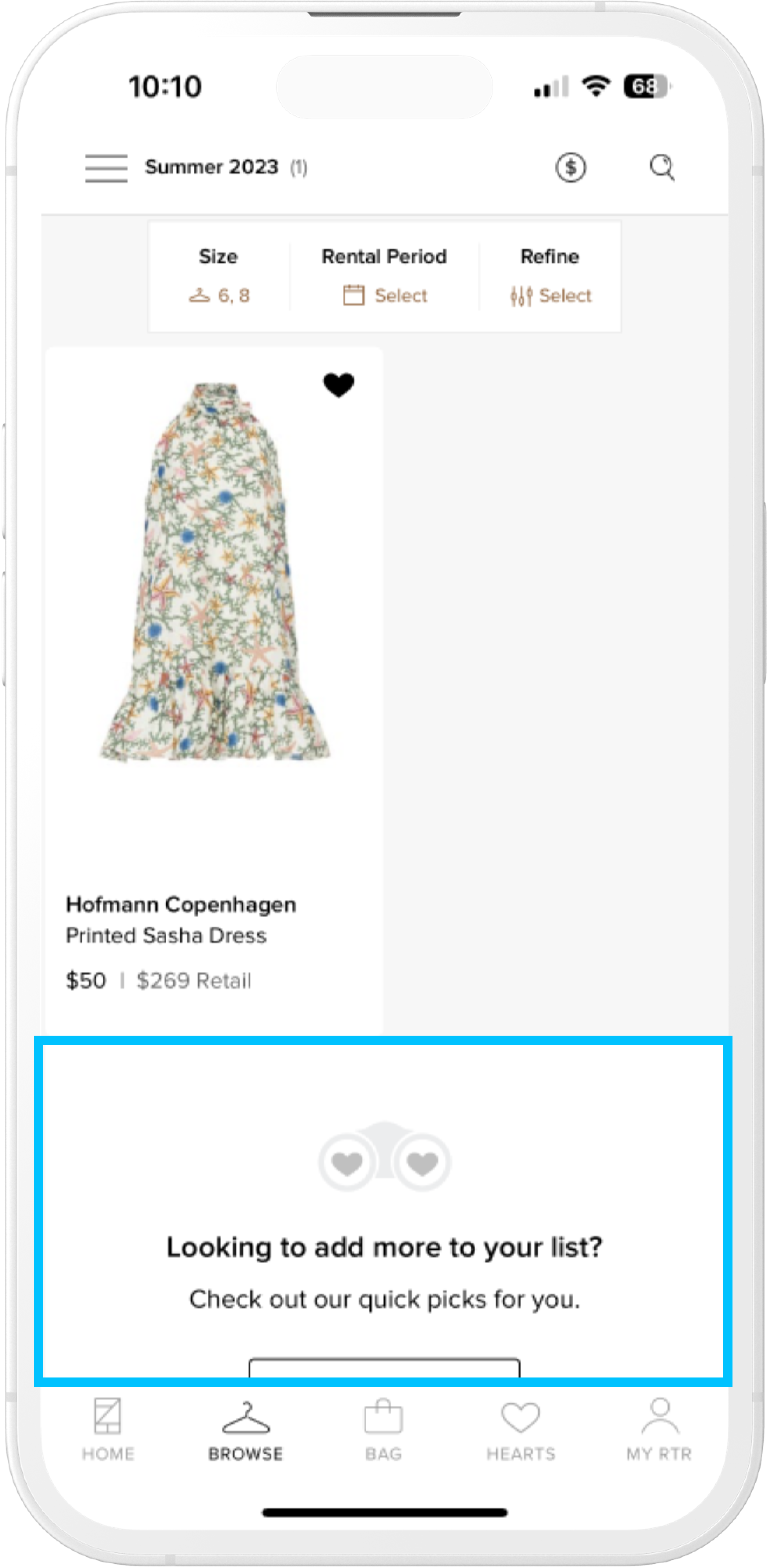
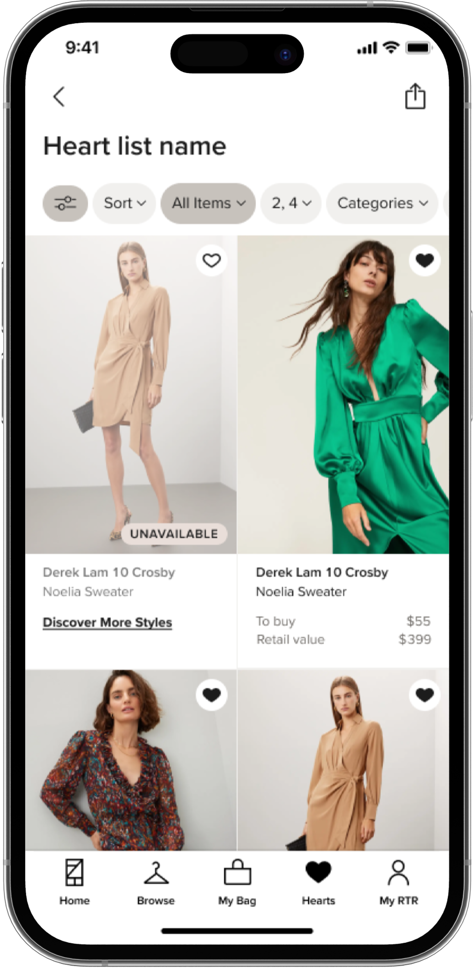
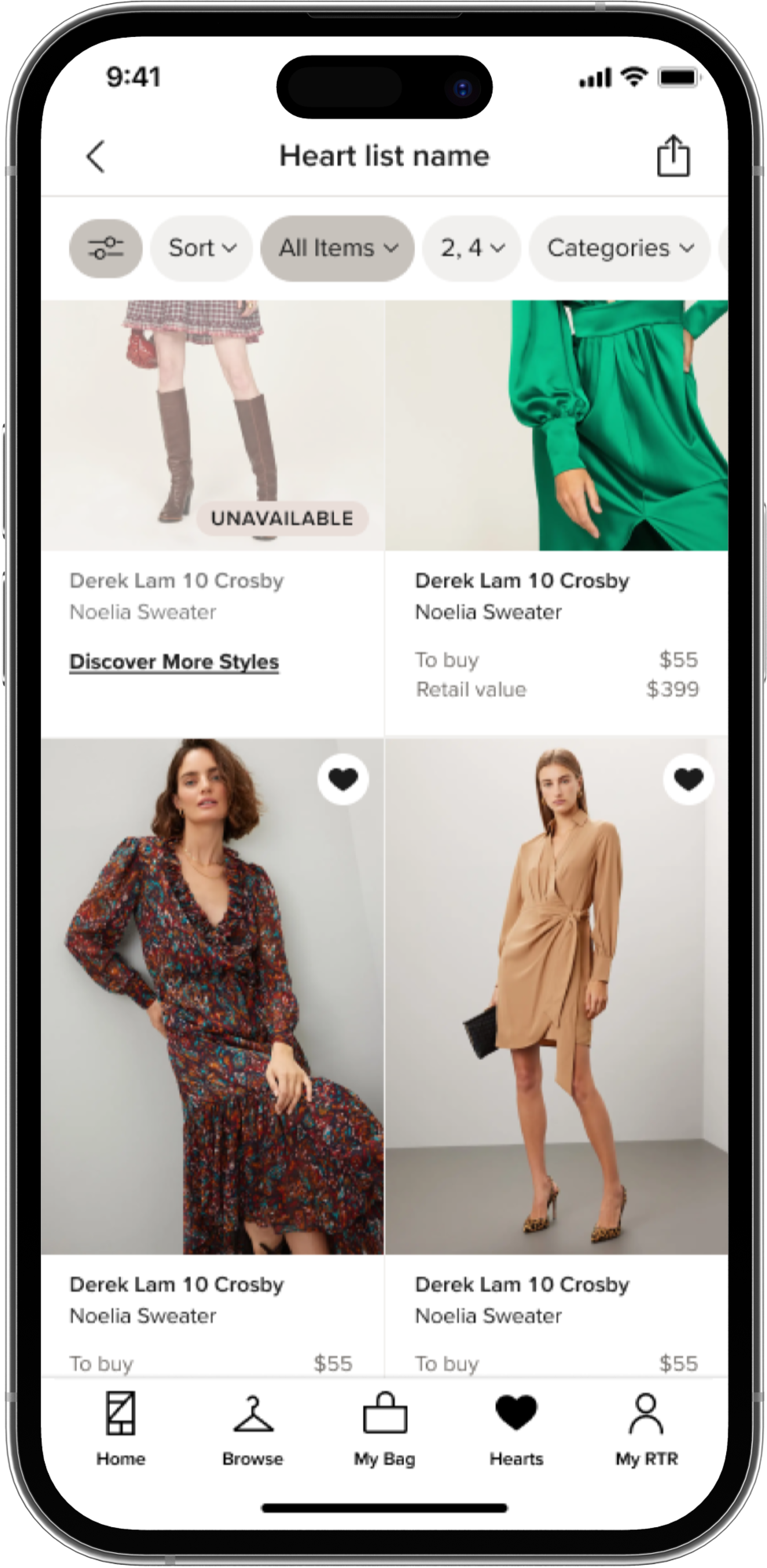
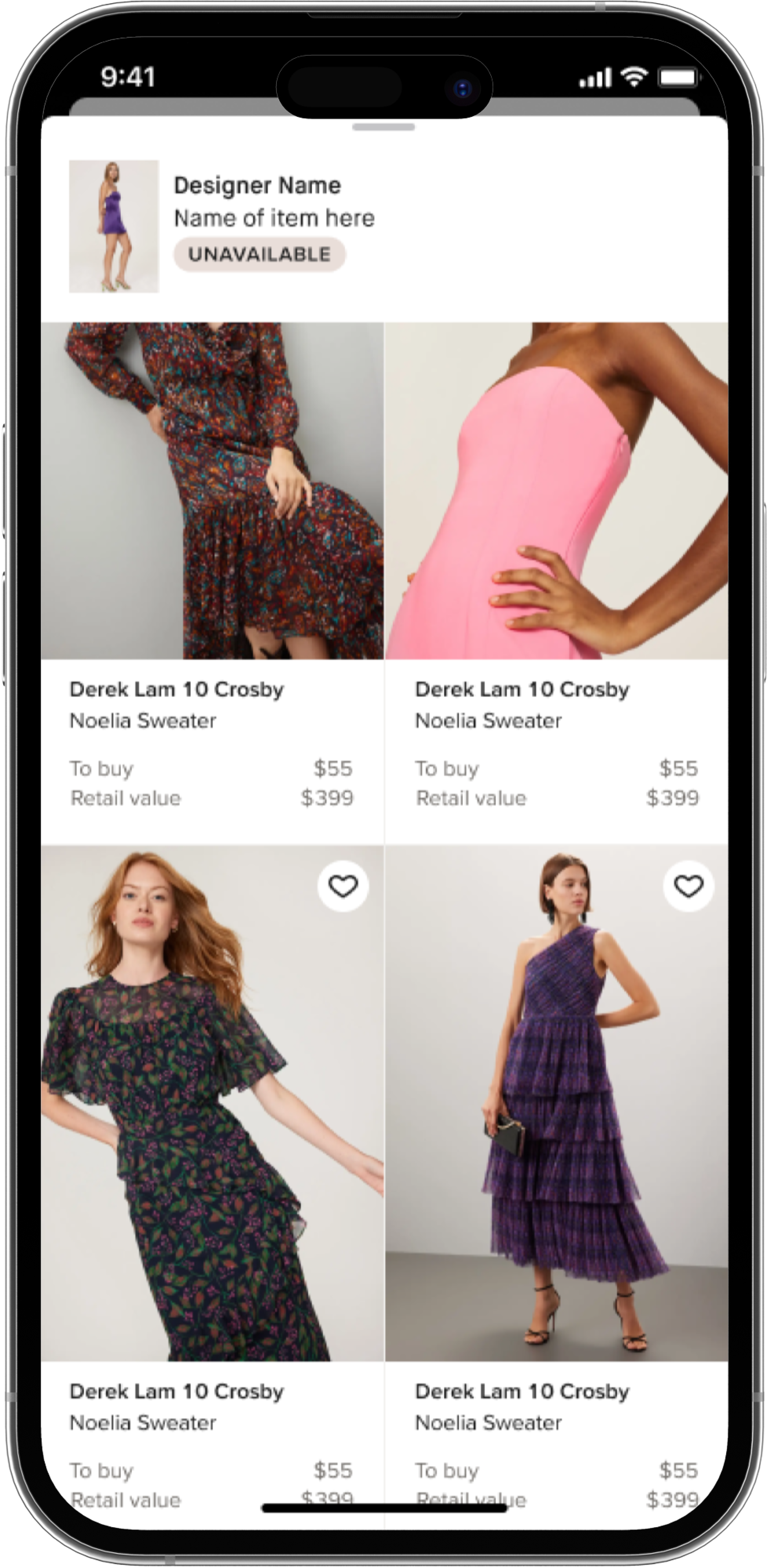
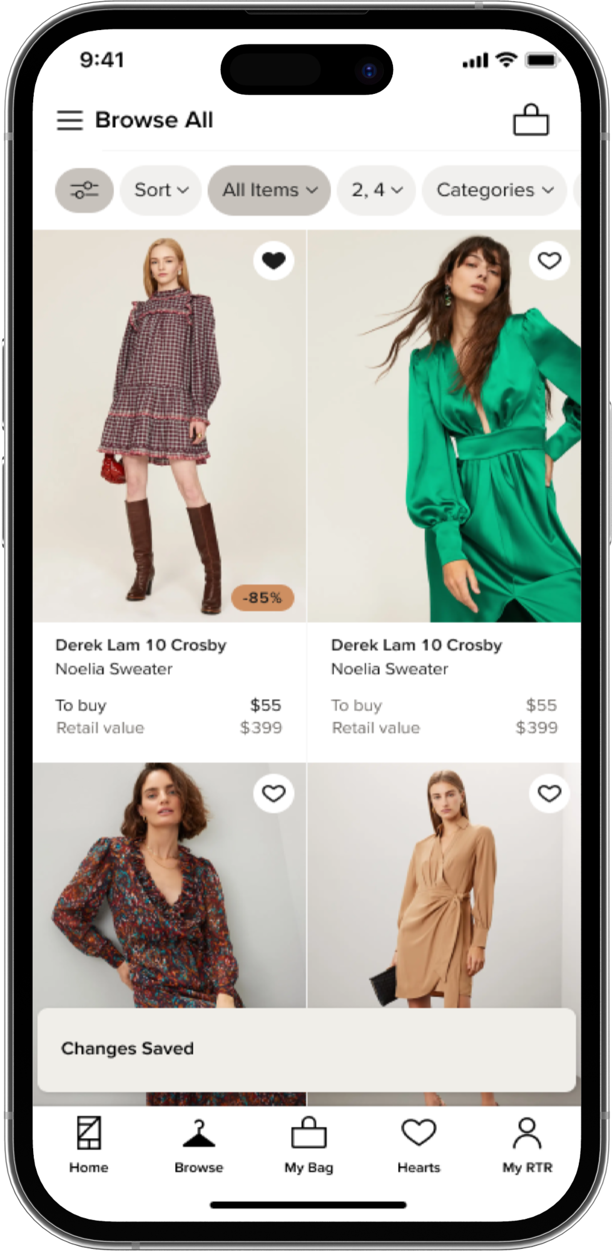
HTapping into a list brings users back to a heavily filtered grid. In this example the user has no idea if the item is available at this point and is met with a dead end without immediate suggestions
Early UX
DEFINE
After identifying key pain points and aligning on what can be done with the refactor on a tight timeline, we moved into creating wireframes to get across some of our ideas.
Key things we wanted to address were:
- Keeping users within the 'Hearts Mindset'
- Transparancy; don't lead users down a disappointing and time wasting path
- Avoid dead-ends; allow for further discovery especially when an item in their hearts may be unavailable in their size
- Use the Hearts work to setup Grid Refactor and other future projects for success; this includes Grid Layout and Filtering
- Visual updates to reflect newer brand direction
Updating hearts tab to reflect larger, more editorial styles and moving the "new list" action to be floating in the bottom right
Tapping into a list, would bring the editorial shot as a header and default to available items within that shortlist.
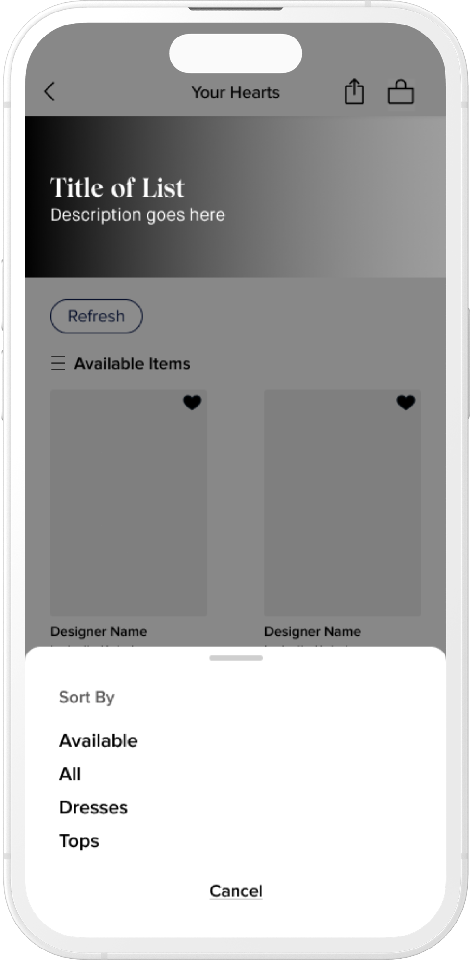
Quick exploration on updating filters. At this point we had not committed to touching filters for this project as it had wider implications.
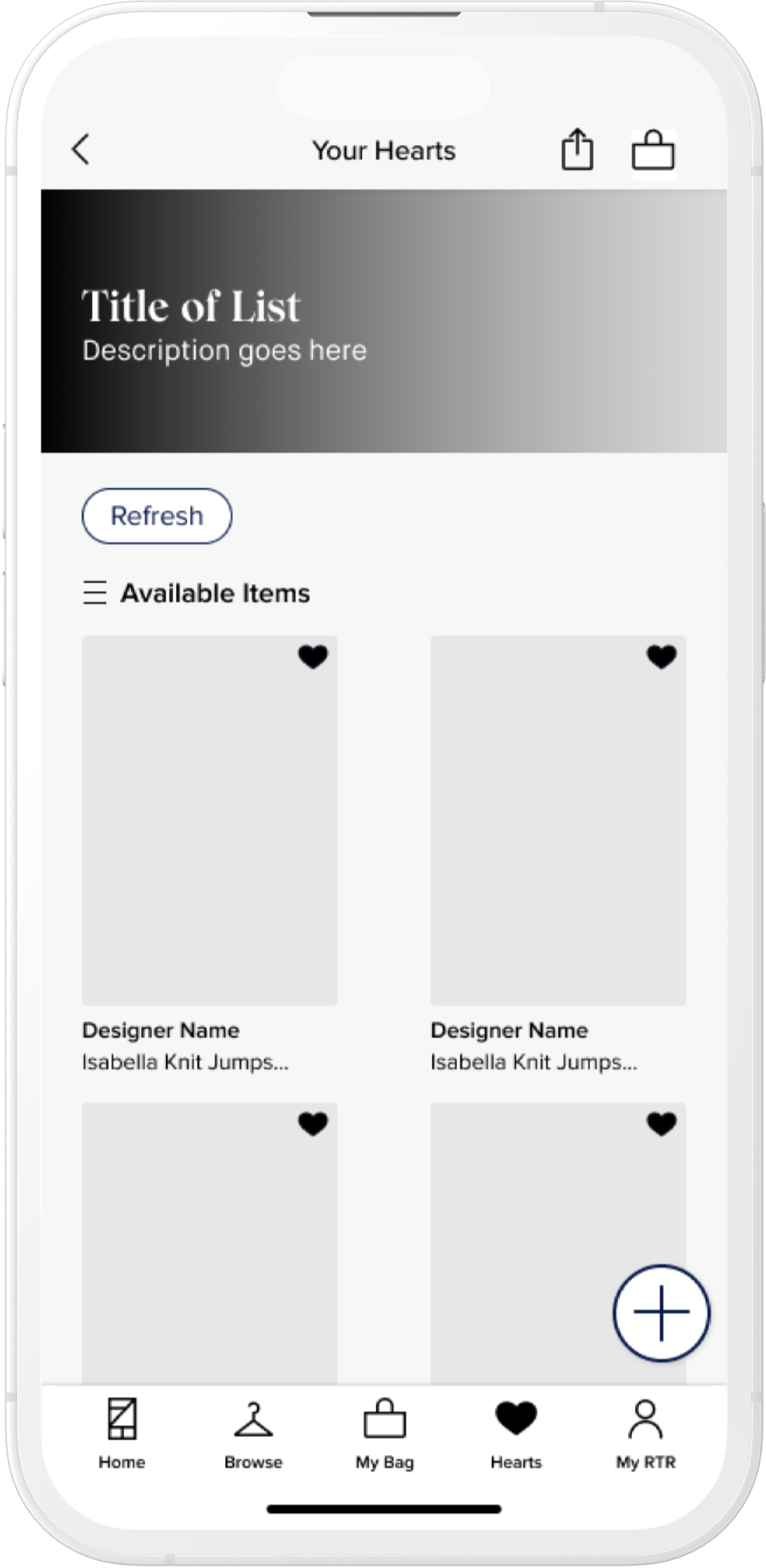
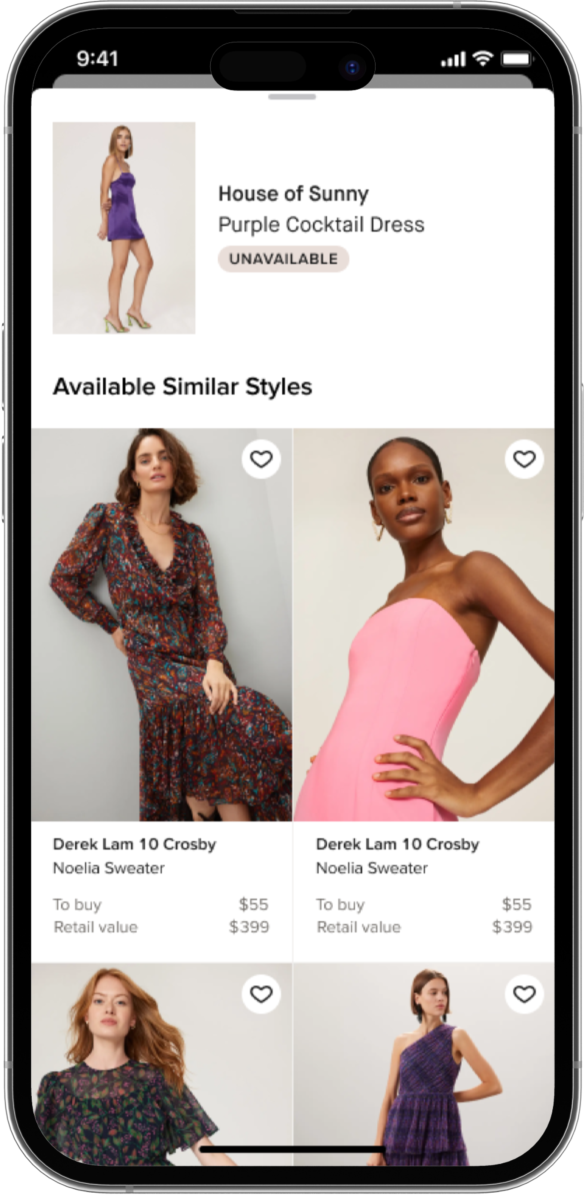
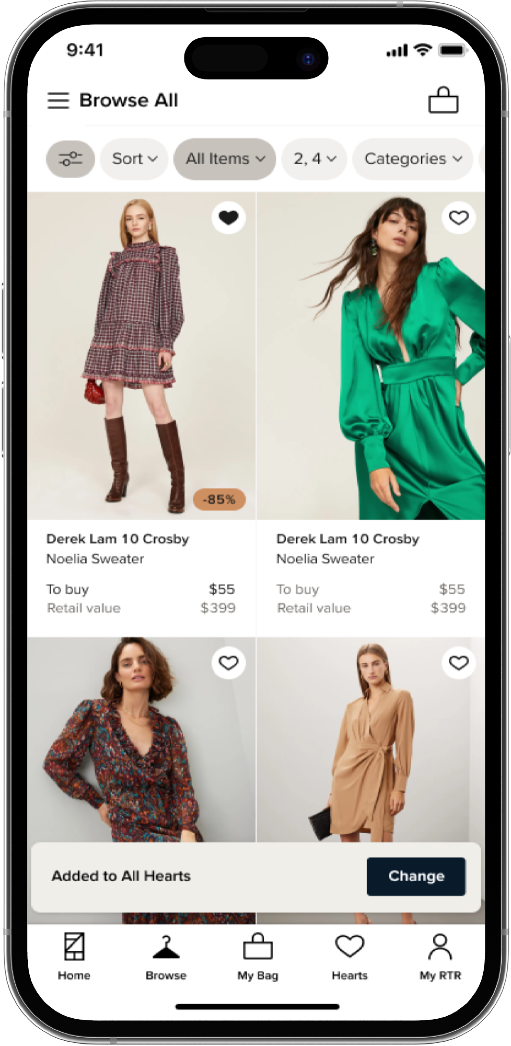
Scrolling through a shortlist after available items, users can see similar items that work with the list with the ability to "refresh" or reload suggestions
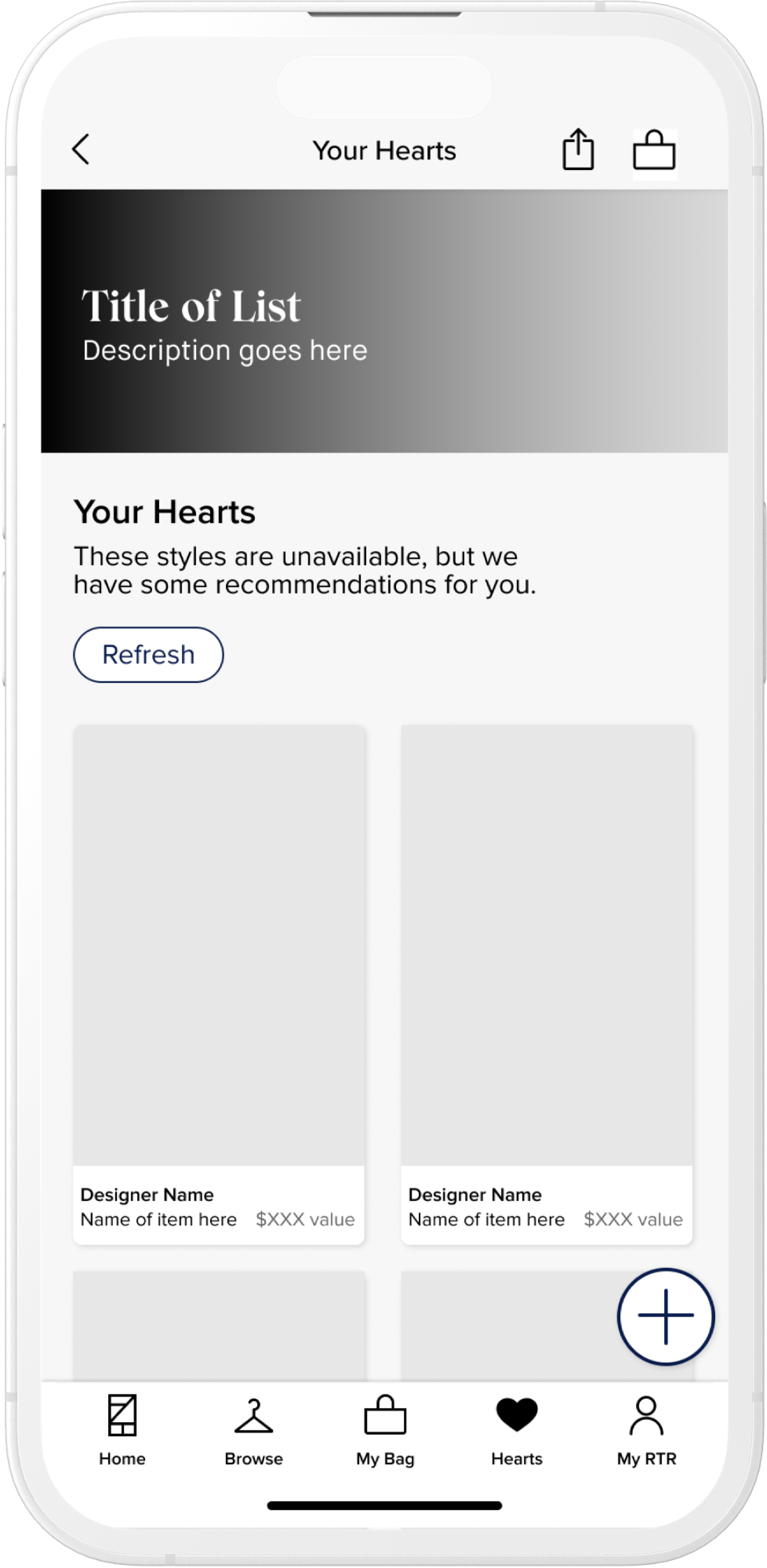
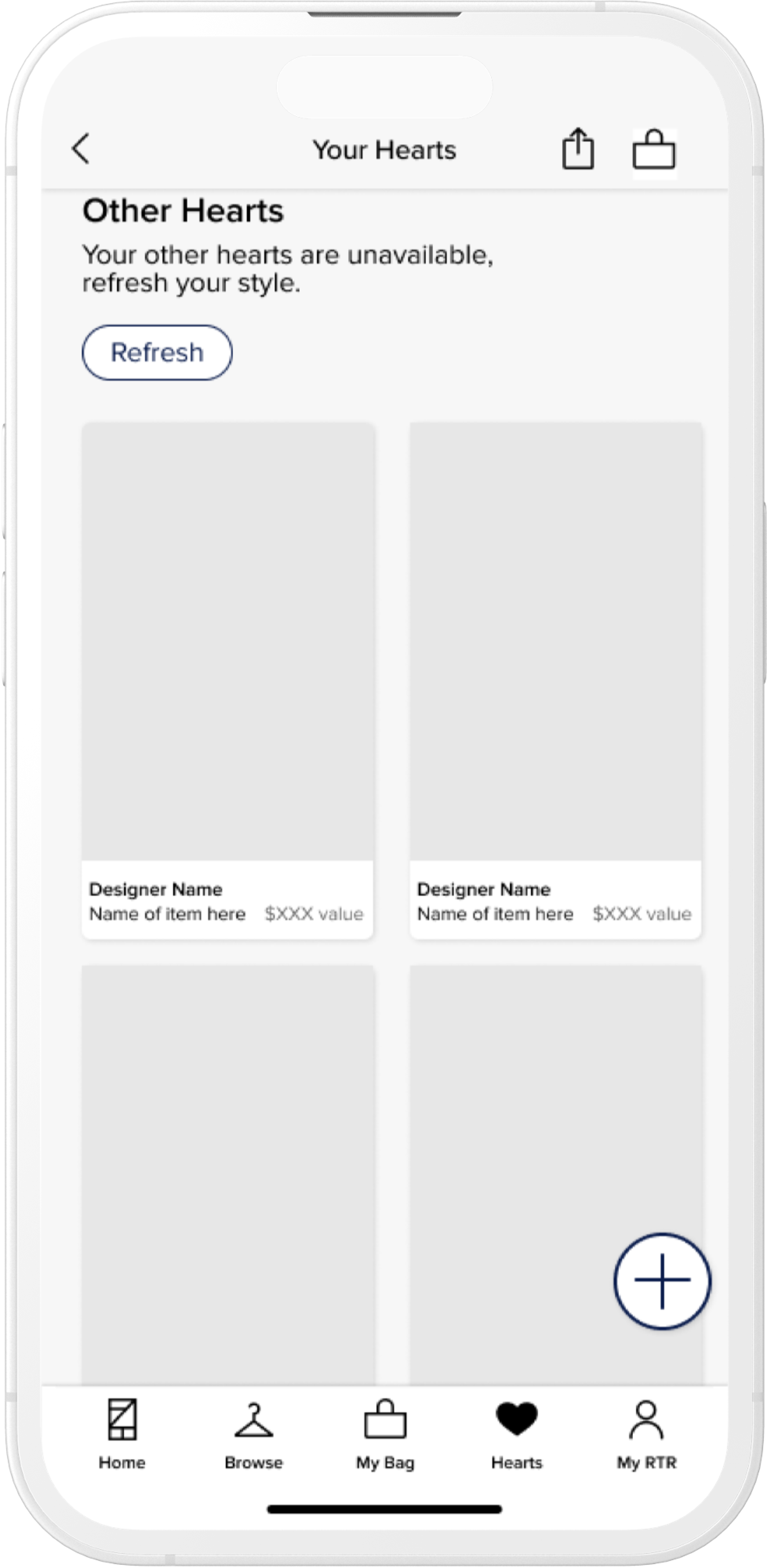
If all items within a Hearts list are unavailable, showing them recommended styles based on their list attributes
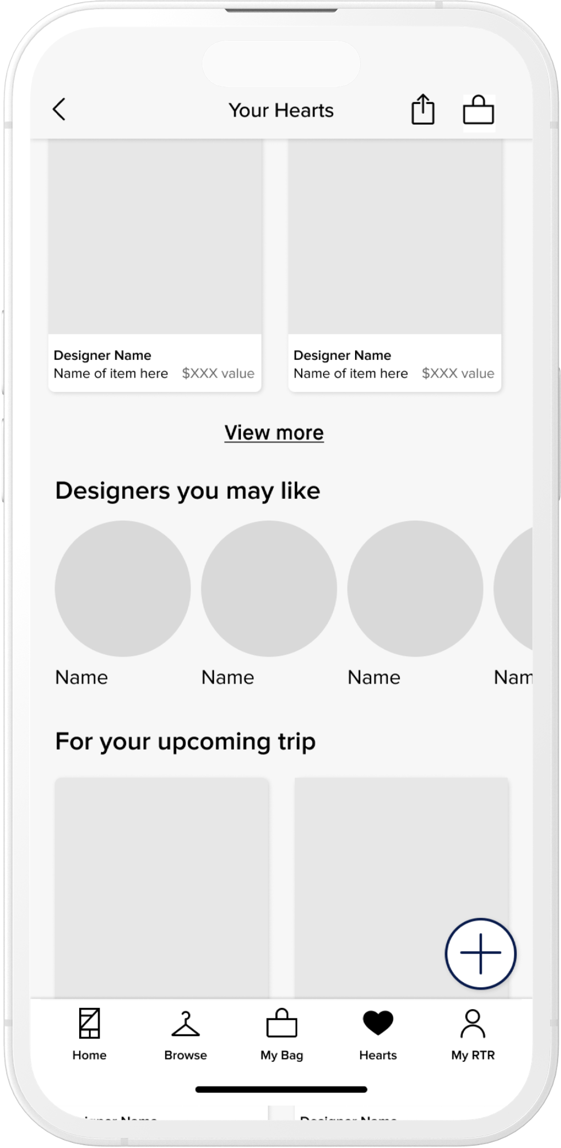
Additional ways to smartly make suggestions for unavailable items. In this case Designers that 'vibe' with their list and AI powered suggestions based on list attributes
Testing
USER TESTING
Tested key designs with 7 users. After getting the go-ahead on addressing Filtering, we wanted to understand a preference in filter methods. Additionally we wanted to gain general sentiment and understanding around three key screens.
KEY FINDINGS:
- Users overwhelmingly preferred the filters at the top instead of the persistent floating "island." We believed this method also gave us more flexibility moving forward into the overall grid refactor.
- Users appreciated knowing items from their list were unavailable up front and were pleasantly surprised that we gave them accurate alternatives instead of a dead-end
- Overall, the new look and feel of their lists was well received.
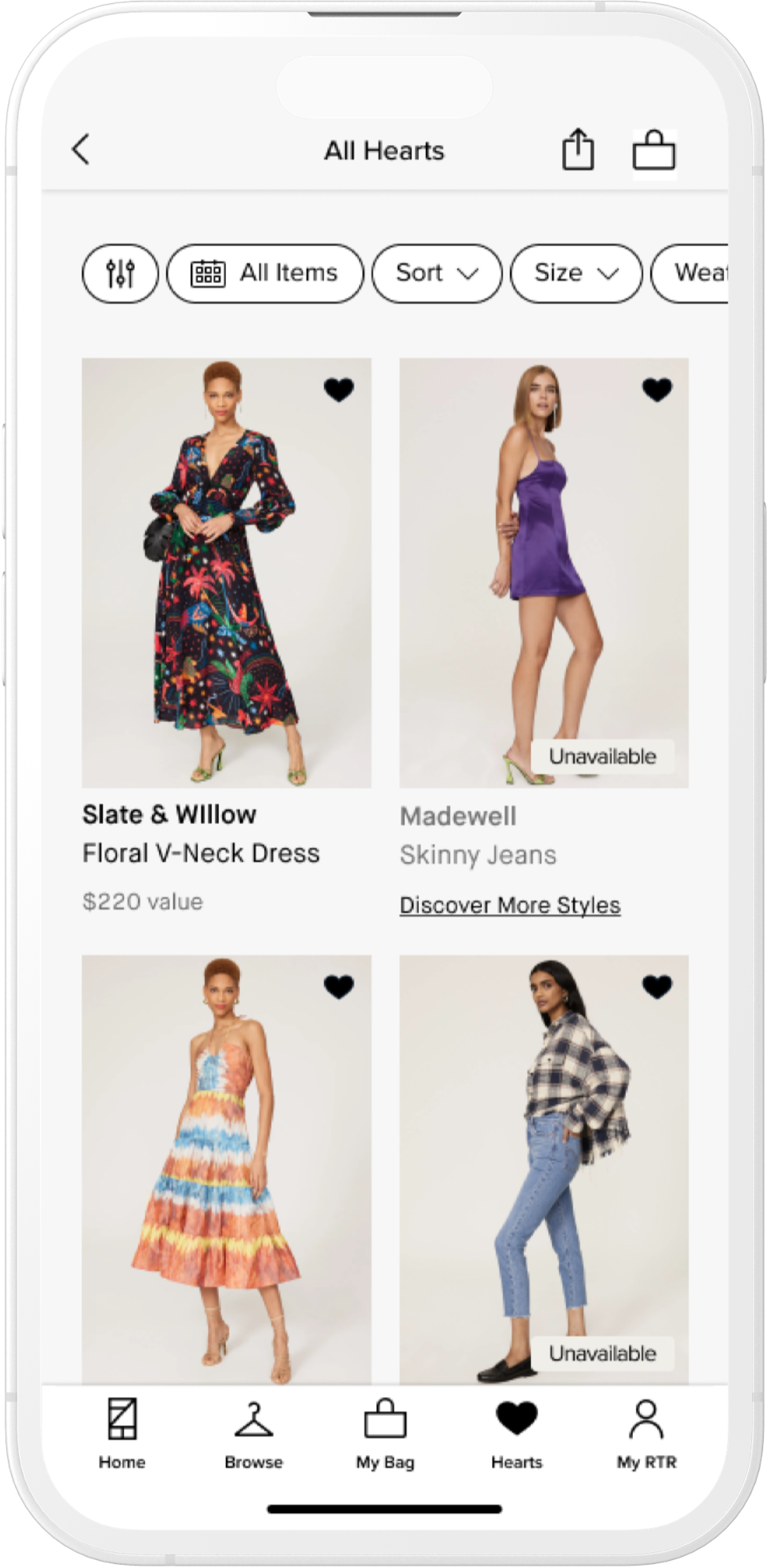
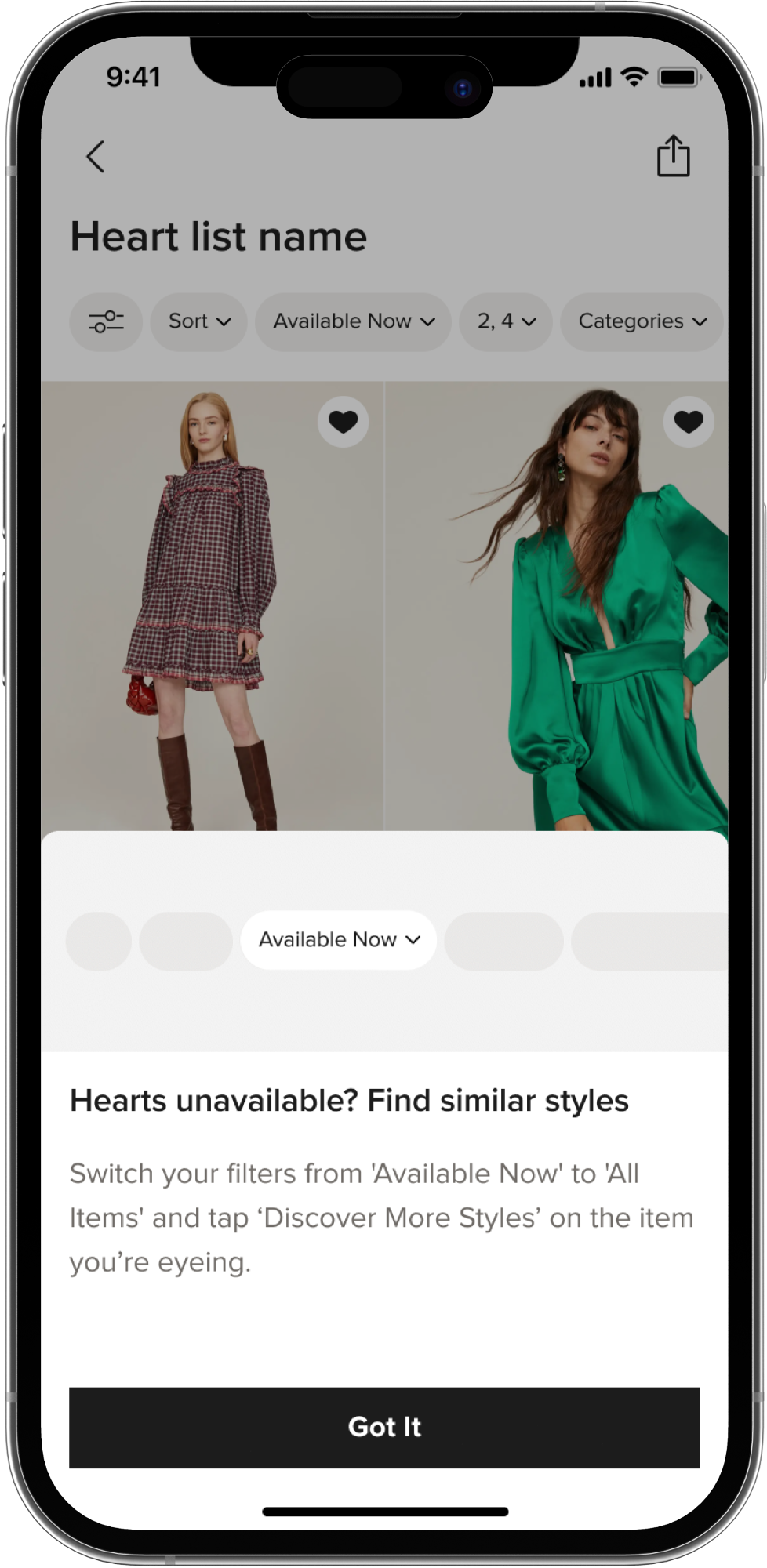
Users met with a persistent dynamic "train" filter and callouts on grid images if an item is unavailable in their suggested size(s)
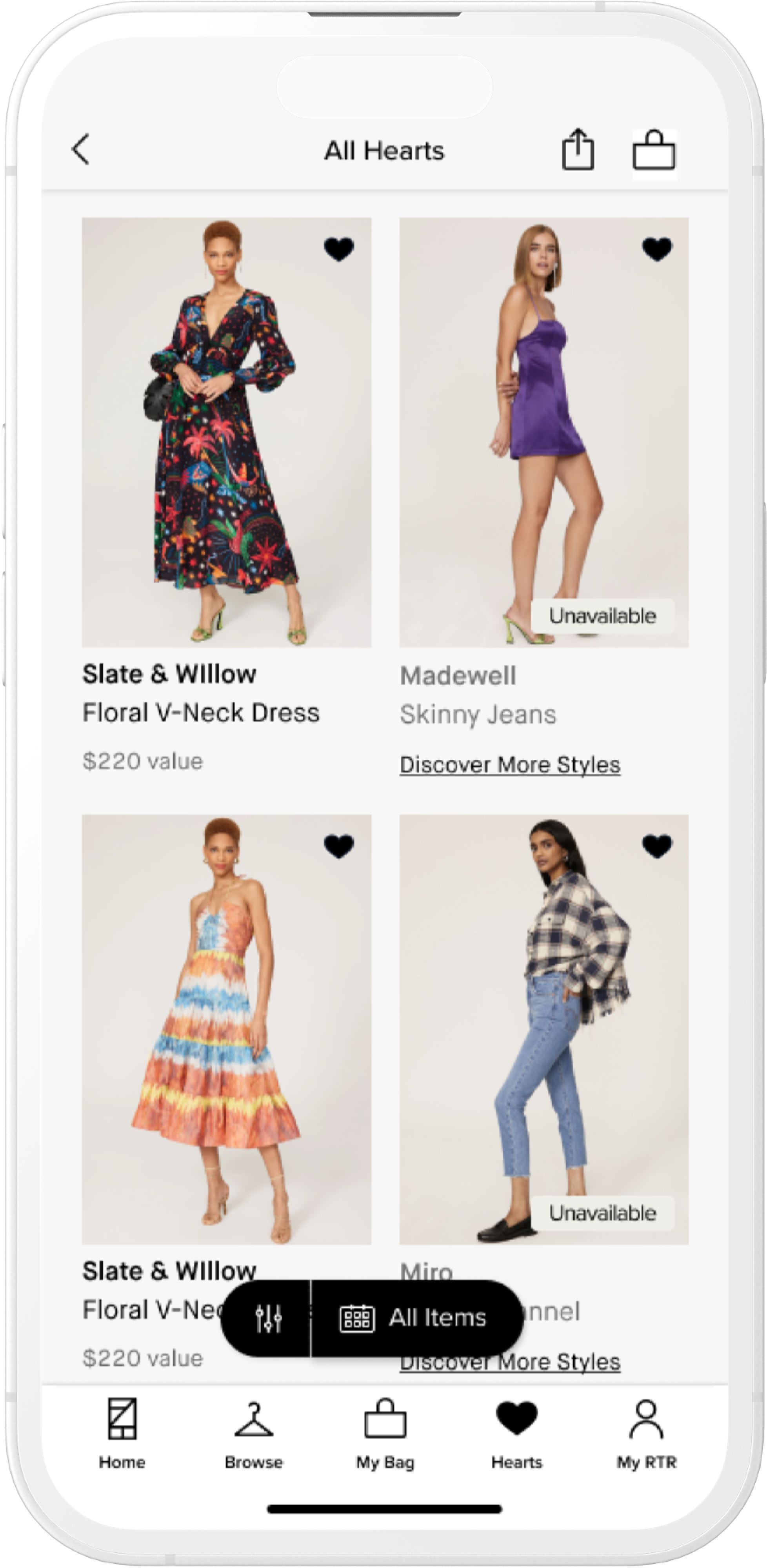
Users see a filter "island" that is pinned to the bottom of the page. We found this was less clear and not as intuitive given our varying user types
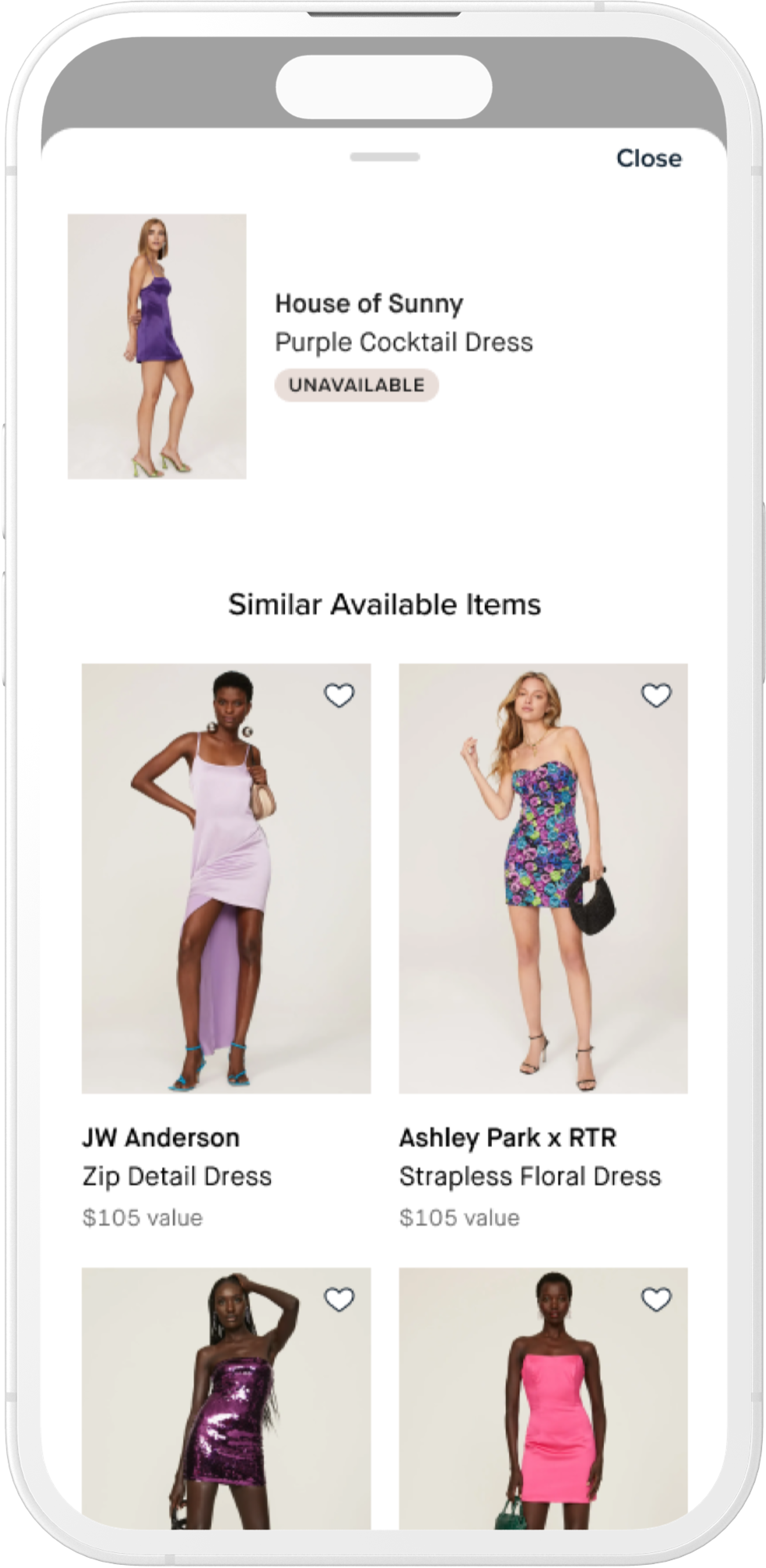
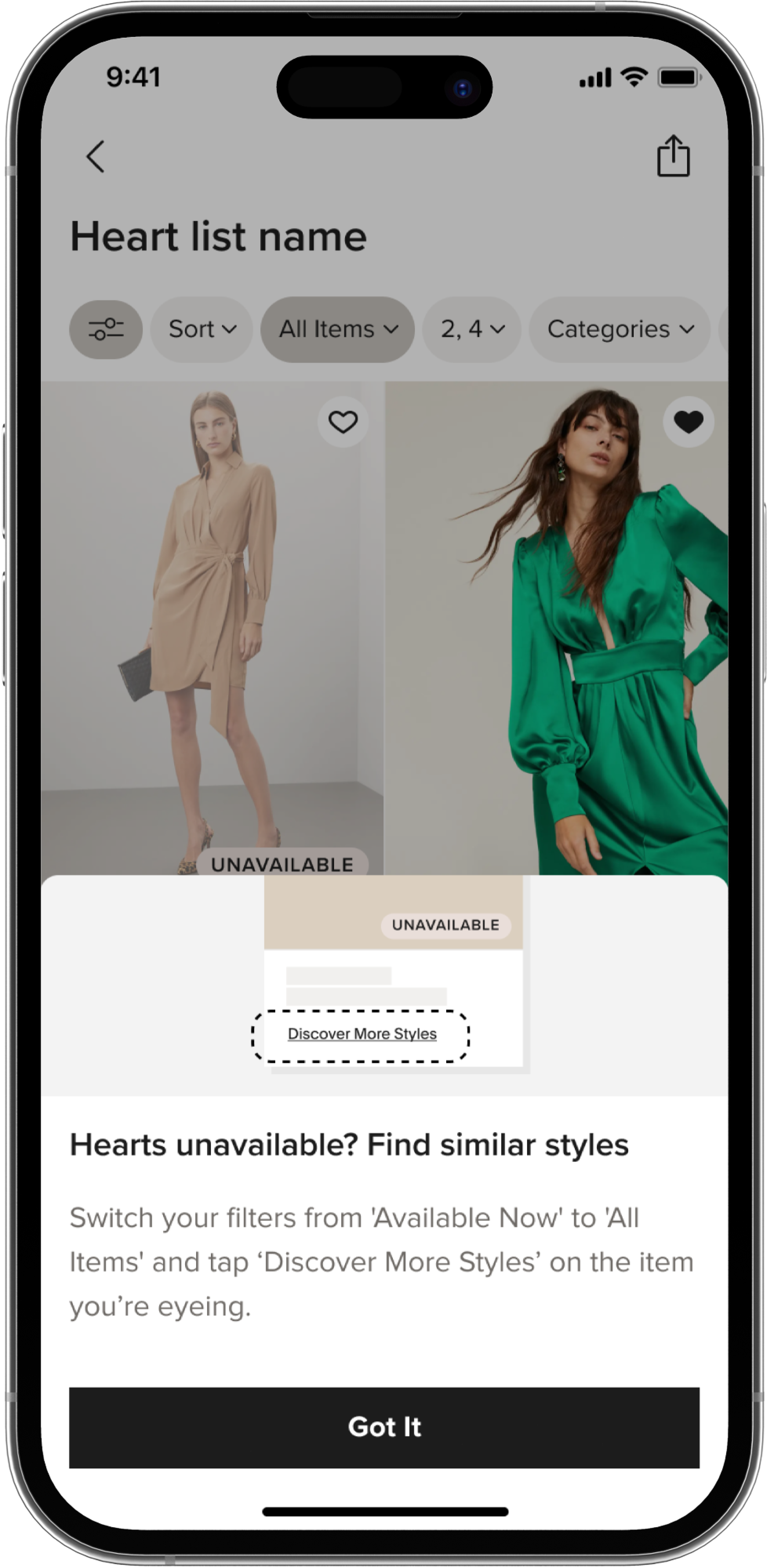
If users tap on "discover more styles" from the grid they are met with a sheet showing available recommendations. Users were pleasantly surprised by this feature and we learned it could be more obvious on grid.
Final Designs
DESIGN
Moving forward I created designs to align with new branding and utilized feedback we received from users to create the best possible experience. Because this was such a big change to how users browse their hearts, we also created a GTM experience the first time a user interacts with their hearts to showcase the changes.

RESULTS
Results after 3 weeks. Launched Jan 2024

Increase in engagement with Unavailable Hearts. Original goal was 30%.

However, there was a 4.9% decrease in add to bag rate. We need to work with Data to make sure we're giving users the best alternative recommendations possible.
Selected Works