Rent the Runway’s PDP is the second most trafficked page in app. Our team was tasked with redesigning the page for faster checkout and an elevated look and feel.
RESPONSIBILITIES
CORE TEAM
KPIs
Design Sprint Lead • Lead Designer • Presentations • DEV Handoff • VQA
PM • ENG Manager • Copywriter • 2 FE Devs • 4 BE Devs
Decrease time to pick 2-5% • 'Increase Buy' in app by 30%
The Challenge
BUSINESS GOALS
RTRs app was heavily outdated technology-wise as well as where we were heading as a company branding-wise.
By moving from Obj-C to SwiftUI we aimed to eliminate tech debt and improve the over all user experience. We started our app re-factor with our 2nd most visited page, PDP.
USER GOALS
The original PDP had a number of friction points for decision making, availability being key among them.
We wanted to put key deciding factors up front to help reduce users’ cognitive load and quickly add an item they want to rent to their bag.
Design Sprint
DISCOVERY
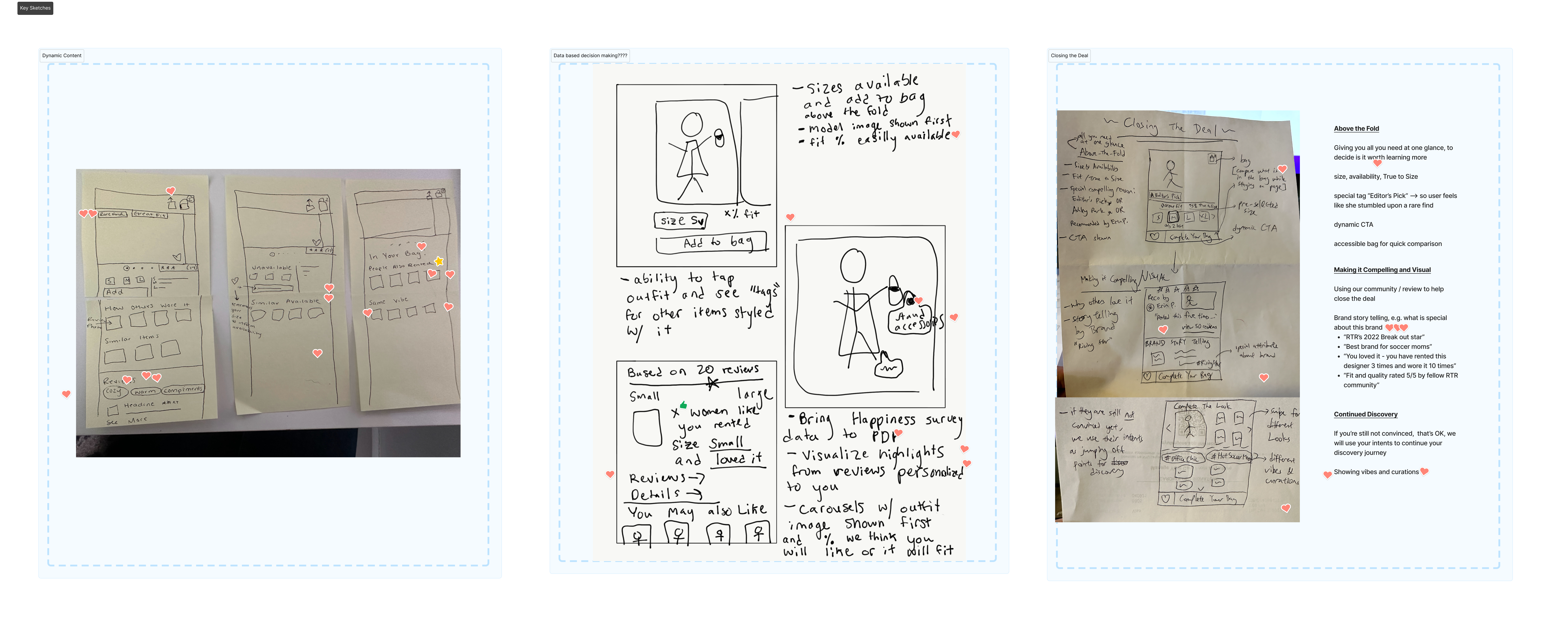
We started the project by holding a 5 day design sprint. I led a group of ~10 coworkers across the organization through exercises where we identified holes in our current PDP (using data) and how we can improve it moving forward.
Before moving into sketching & solutions, we identified 4 key areas to focus on for the project:
- How can PDP be a frictionless and exciting step in the discover journey?
- How can PDP showcase our unique value prop: unmatched financial value & personalization powered by customer data?
- Provide relevant, digestible information at a glance to close the deal
- Design for continuous testing to drive engagement and upsells.

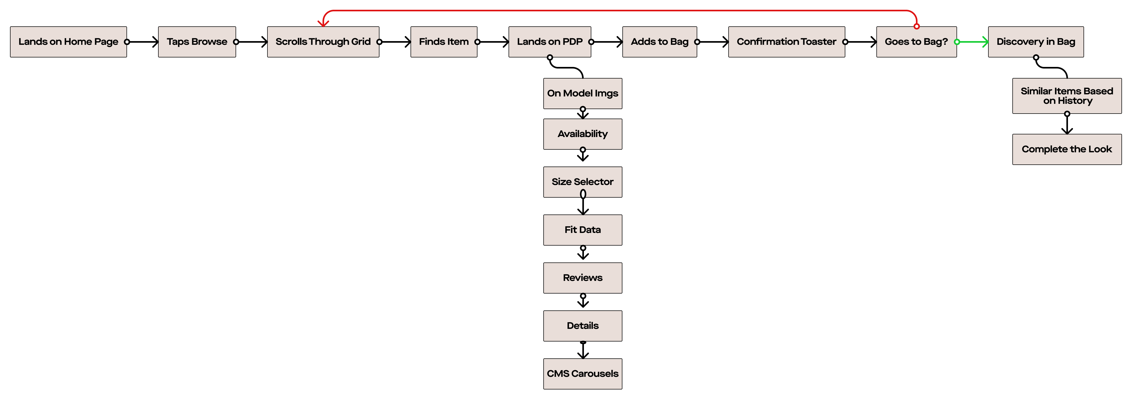
Early UX
DEFINE
After three days of user mapping and sketching, we jumped into wireframes and design to test with customers and make sure we were on the right track before presenting findings to key stakeholders and moving into our sprint cadence.
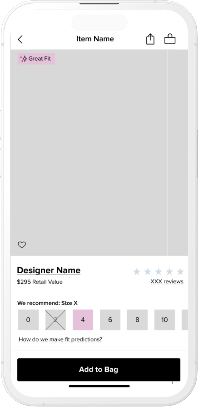
Large main image carousel with most important information–availability–within the viewport
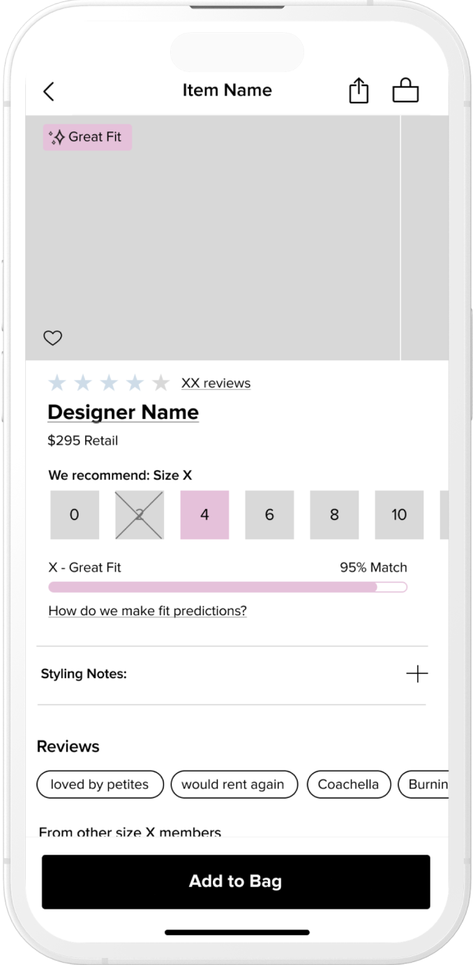
Smaller image carousel with all important information within the viewport
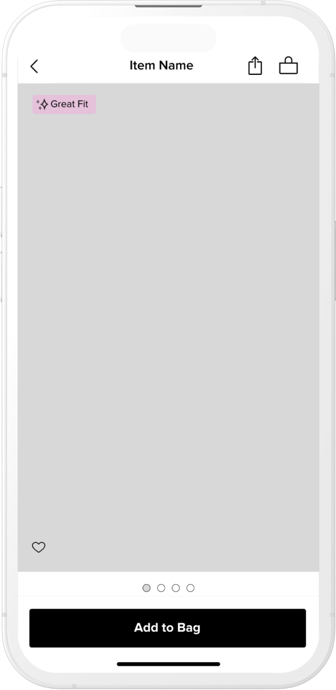
Image carousel taking up majority of the viewport and all other information a short scroll away
Final Designs
DESIGN
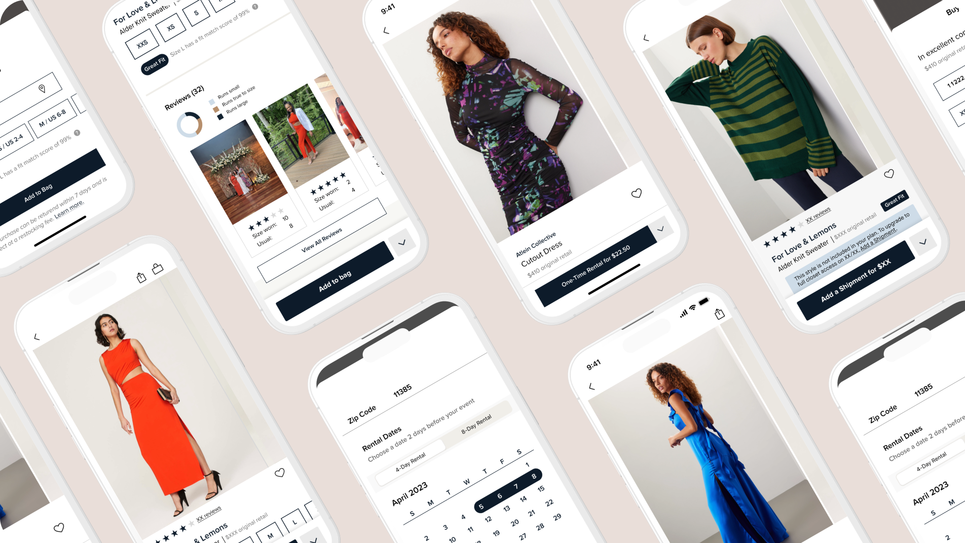
After testing with ~10 users, we settled on larger images while keeping necessary information in view. This information is size and availability, fit related information if applicable, followed by reviews, details and item discovery carousels towards the bottom of the page. Prototype of experience found here.
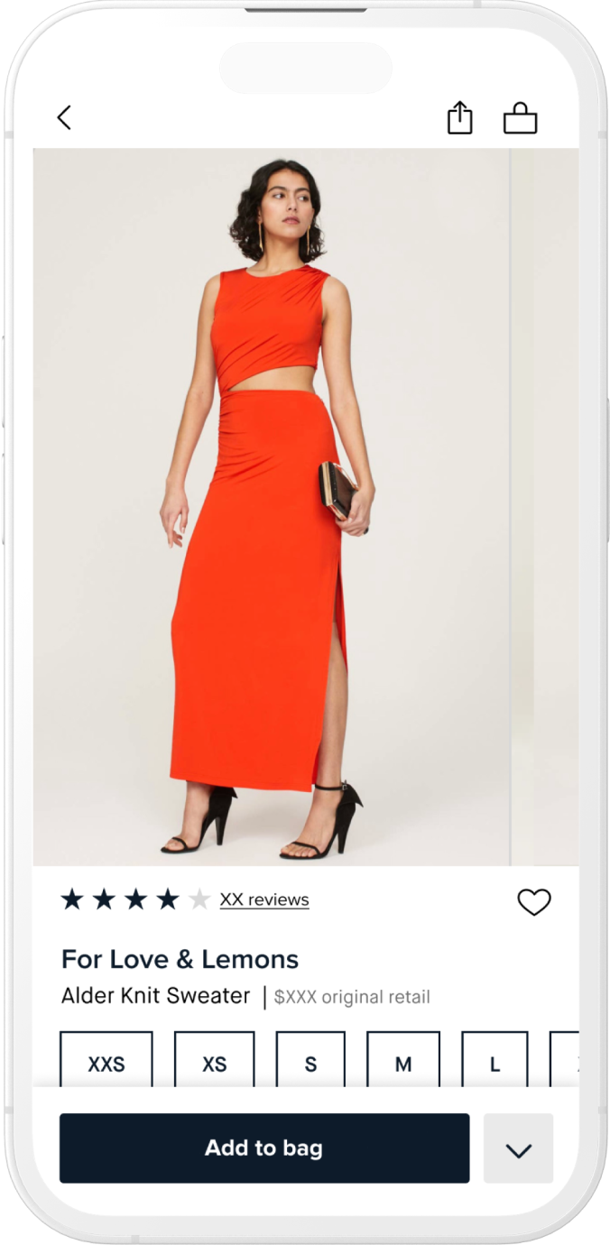
PDP Landing. Users see a large image and sizes with availability and a sticky Add to Bag CTA
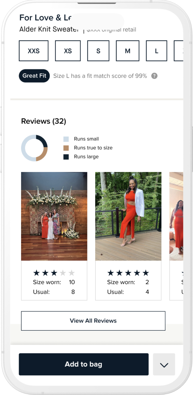
As users scroll they see fit score–if applicable–followed by reviews
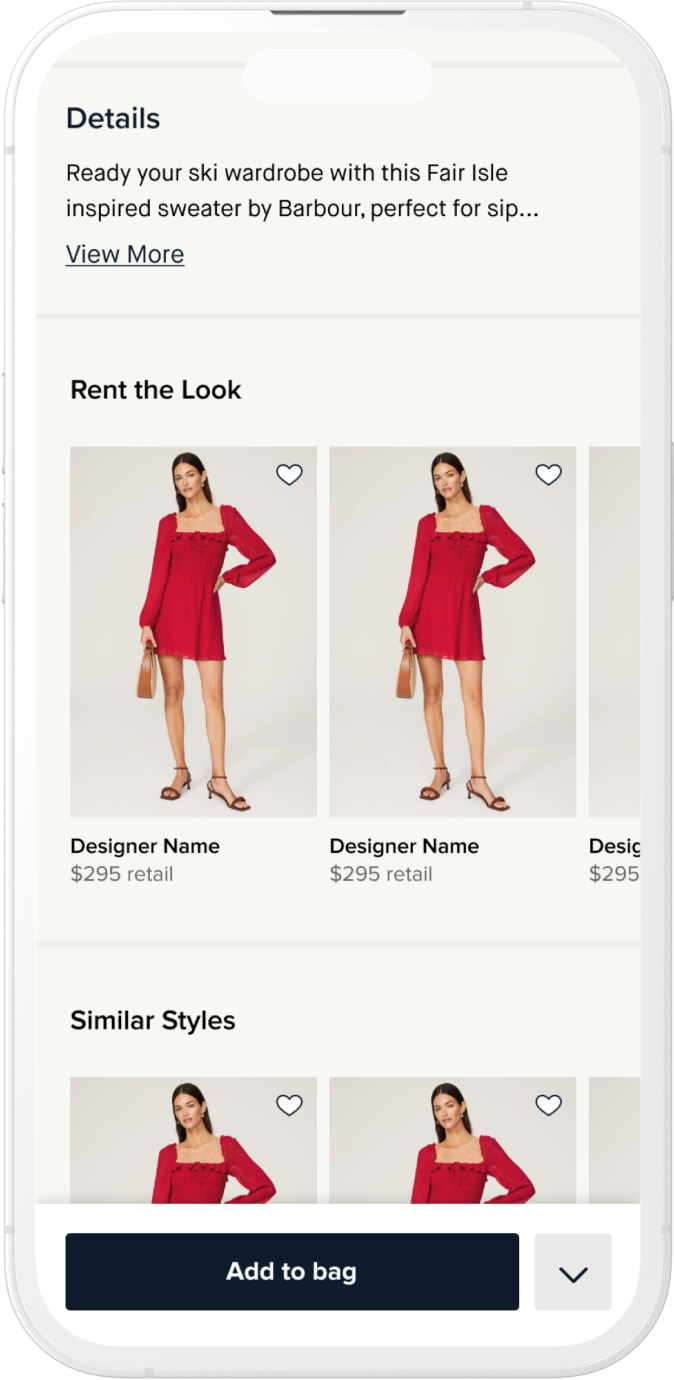
Under reviews users see more details and CMS controlled carousels with suggested items
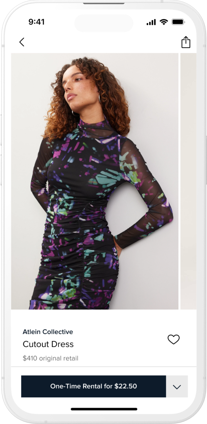
If users are in a One-Time Rental “lens” information is presented slightly different info
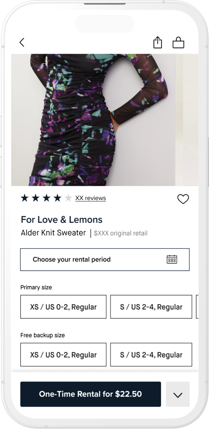
One-Time Rentals require dates to accurately reflect availability of an item
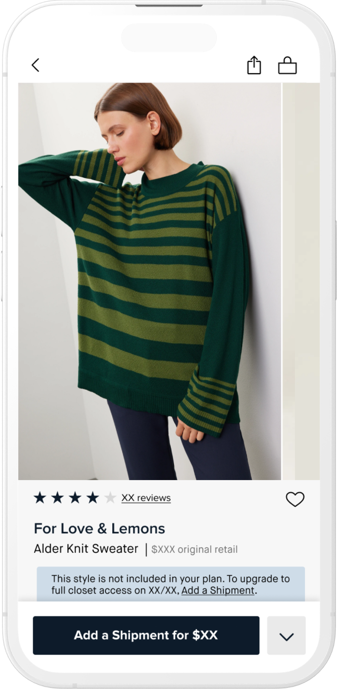
Users without an extra shipment for the month see a banner message and dynamic CTA
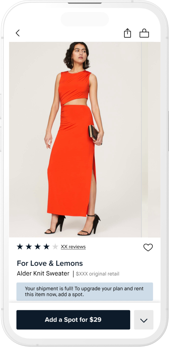
Users who have filled their spots for shipment but may want an additional item
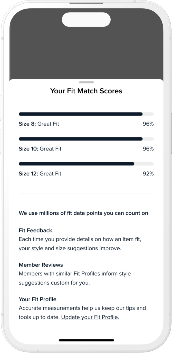
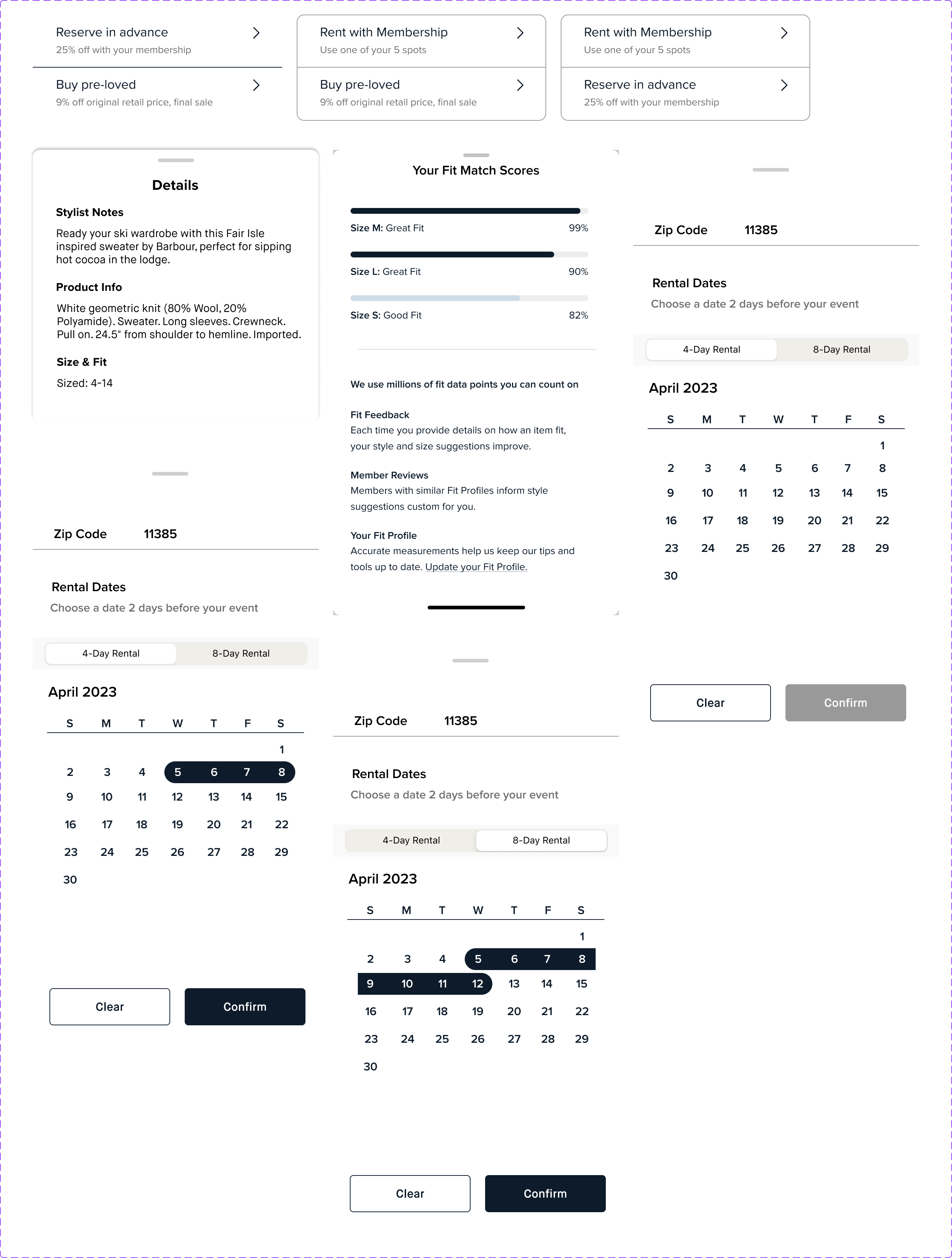
Fit match score percentages and details around how we collect and present that data
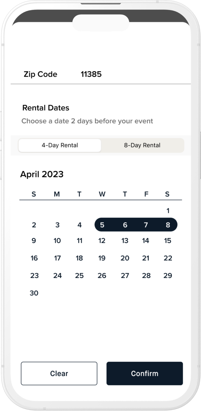
Date selector for One-Time Rentals with ability to toggle between 4 & 8 days
RESULTS
Results from all users now using
the redesigned PDP experience
Decrease in time to pick. ~30 seconds/item
Increase in saved revenue/year due to reduction in churn
Increase of in-app
purchases of items by members
Increase in revenue per year due to increase of in-app purchases
Additional Components
DESIGN
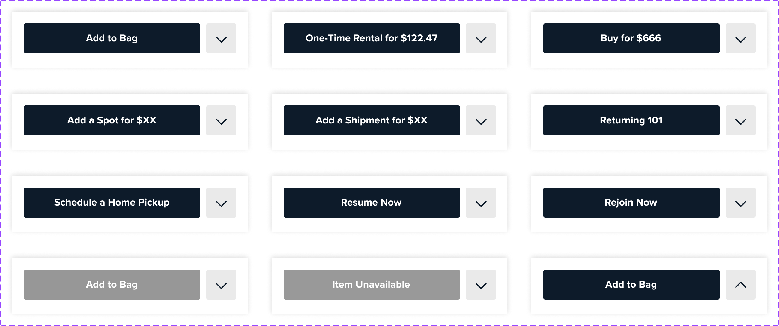
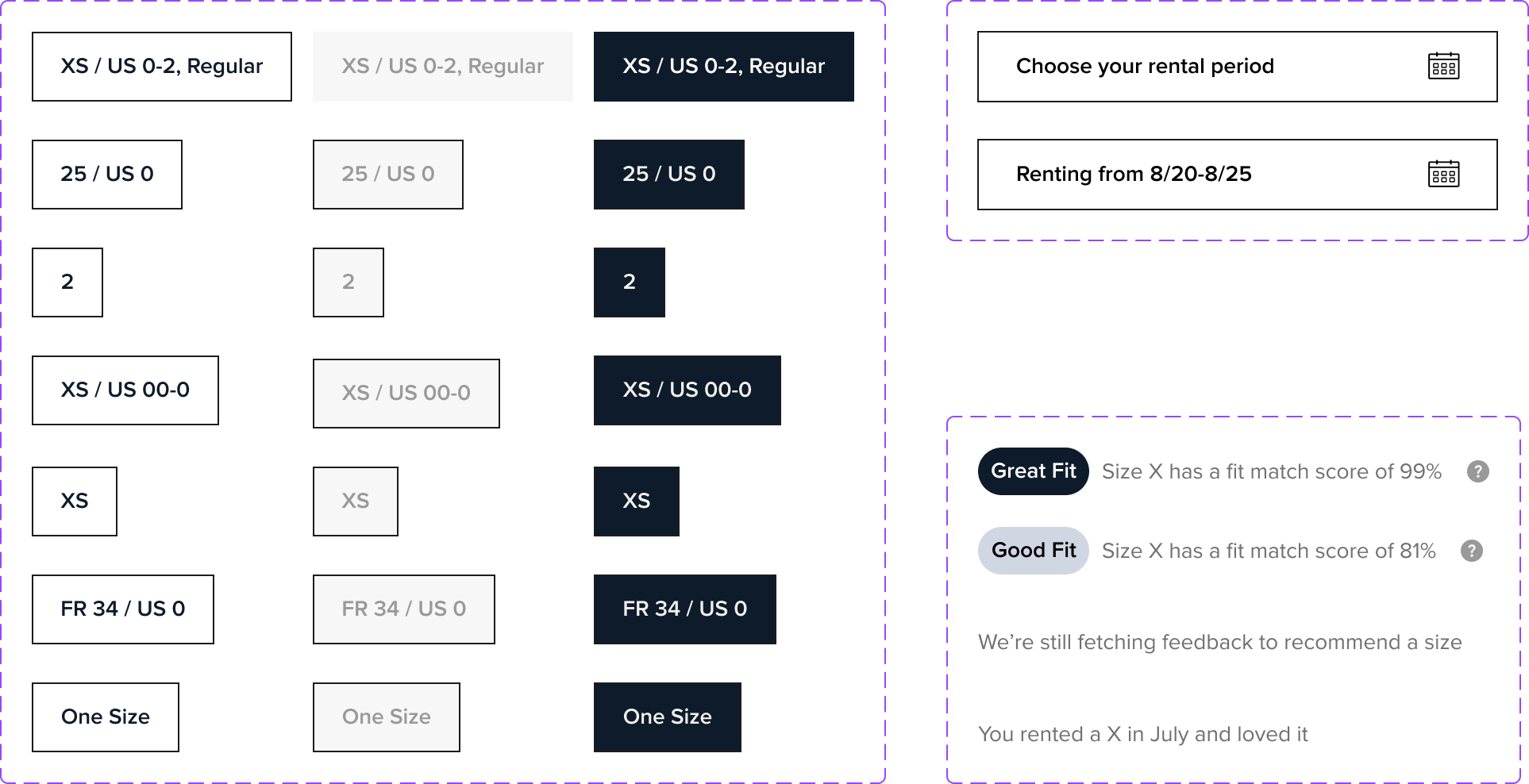
With many different states that users can enter, a component library was necessary to be able to account for each varied state between Membership, Reserve, and Buy intending users as well as all different states accounting for what data we may or may not have available as it relates to user ID.
Selected Works

